sekce.tex
Sections
To be able to create and use widgets within a page, we first need to create sections for the widgets to be placed in.
Add a section to the page using the blue button with the "+" symbol and then select "section" from the menu.
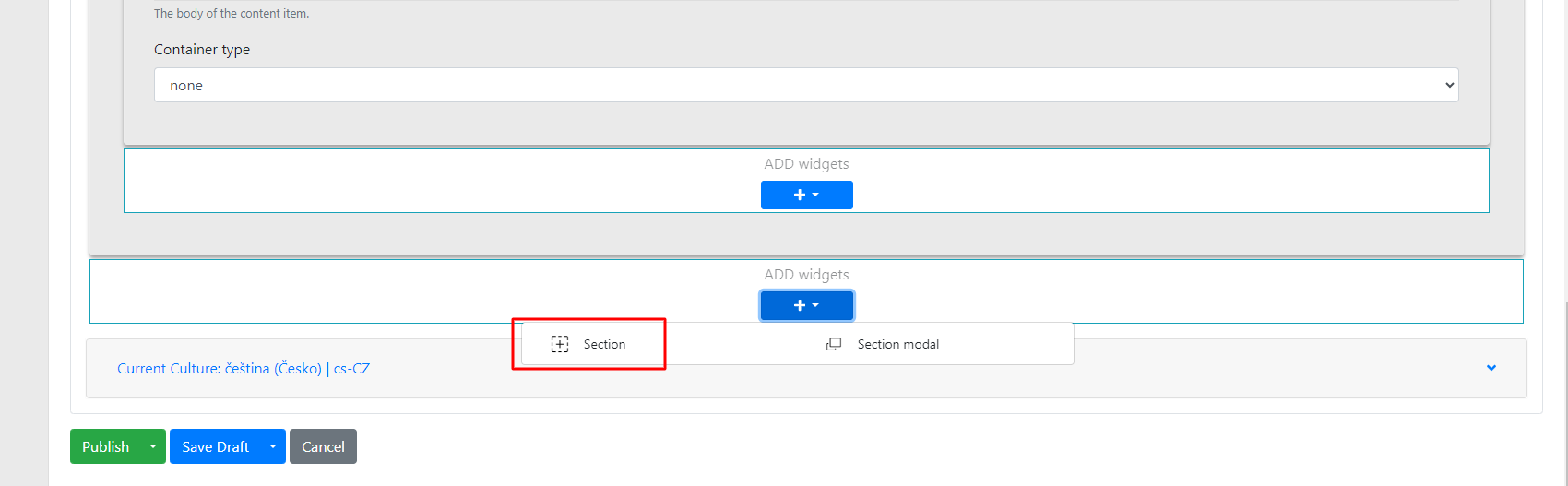
Within the section, there are several options you can configure:
-
Title → this is the name of the section. This name is only for orientation in the administration, so that when there are multiple sections, you know which one contains specific widgets.
-
Checkbox "use container" → used to set the section's indentation from the screen edges.
-
Background color → sets the background colour of the section.
-
Container type → when the container checkbox is checked, even greater indentation can be achieved.
-
Line → sets a line (divider) below the section.
-
Animation type → used to set the animation for the given section and its widgets.
-
Animation → sets what the animation will apply to.
-
Items → individual items in the widget
-
Container → individual widgets
-
All → the entire section
-
-
Animation delay → sets how long it takes before the animation appears.
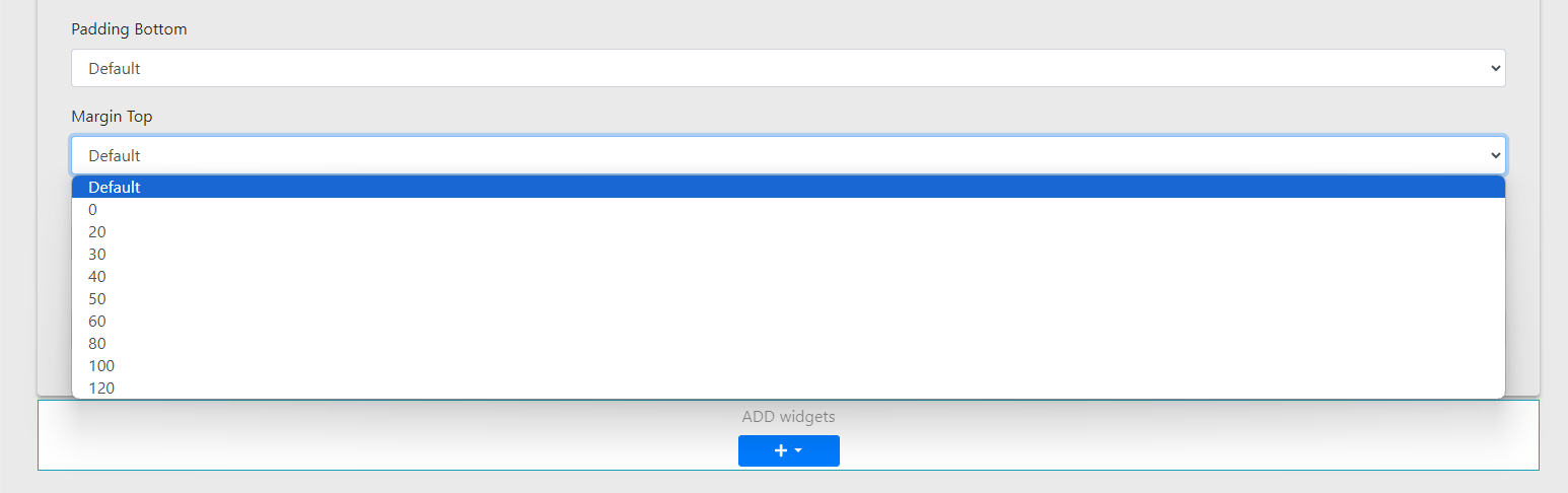
Properties tab
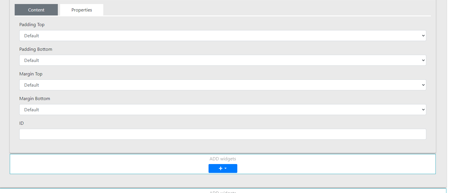
In this section you can configure:
-
Padding Top and Margin Top – used to set the top indentation of the section – selected from options in increments of 10 pixels (range: 0–120 px)
-
Padding Bottom and Margin Bottom – similar to the above, for setting the bottom indentation of the section (selected in increments of 10 pixels, range: 0–120 px)
- ID – used to set an anchor (enter the anchor ID of the link from which you want to reference this section)
Finally, widgets can be freely inserted into the prepared section.