Introduction to CMS
Cache reset
Publishing pages, drafts and cache reset
Draft pages
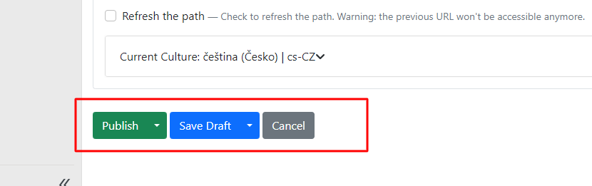
Pages ready in the content section can be saved either as a draft or published directly.
It depends on whether you want to show the changes to website visitors immediately or if you want to continue editing the page.
If you save the page as a draft, the currently published content on the website will not be overwritten. The new changes will remain saved in the page within the CMS.
You can save a draft in two ways:
-
save draft,
-
save draft and continue.

If you choose save draft: after saving, you will be redirected back to the list of all pages in content items. Choose this option when you have finished working on the draft and want to continue working elsewhere.
Save draft and continue: you make changes to the current page but can continue editing within the draft. Saving will not redirect you back to the page list in content items.
Publishing a page
If you want to publish edits to a page directly on the website, choose one of the options: publish or publish and continue.

If you choose publish: the content changes immediately on the live website and you will be redirected from the page editor back to the overview in content items.
Publish and continue: the page content changes are published immediately on the live website, but you can continue editing the current page (similarly to save draft and continue, you will not be redirected back to the list of pages in content items).
Cache reset
Cache reset in CMS means clearing or refreshing the temporary memory (cache) that the CMS uses to store and quickly load certain information. Cache is used to optimise website performance by storing already loaded and processed data so it does not need to be repeatedly fetched from the server.
For CMS version 1.8 and above, it is enough to clear the cache by publishing Global Widgets. No changes are needed — just publish.
During development or when editing a webpage, it may sometimes be necessary to perform a cache reset to ensure that users see the latest and most current version of the content.
Menu
Menu is one of the most important parts of a website.
You create a menu in Content -- Menus.

Use the "new Menu" button to create a menu.
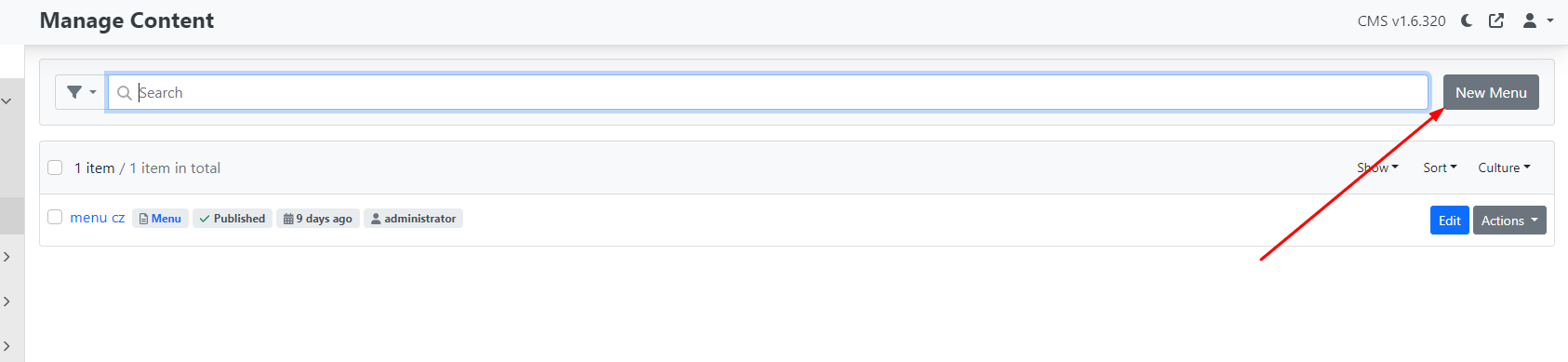
After clicking the menu, you will see the following options:
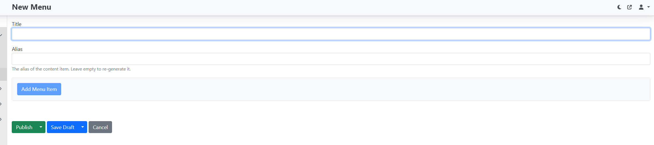
Fill in the "title" — the menu name.
Note: If the website has multiple language versions, we recommend combining the menu name with the locale, for example "menu cz" for the Czech version and "menu en" for the English version.
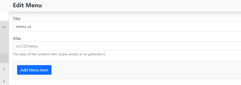
Alias — does not need to be filled in; it is created automatically after saving (for the default Czech locale, cs -- CZ/menu will be created).
Save the menu using the Publish button. If you do not want to publish it yet, choose Save draft.
Adding pages to the menu
Only pages that already exist in content items can be added to the menu. They must therefore be created first.
Add items to the menu using the Add Menu Item button.
After clicking, you will see the available options.
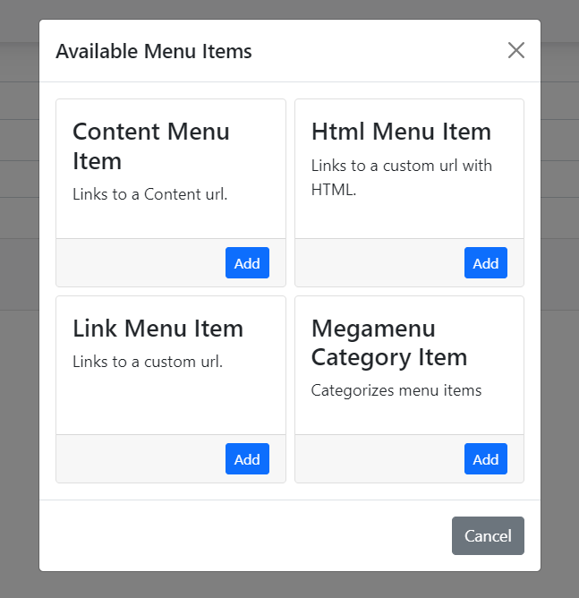
Menu item types:
There are 4 types of menu items:
-
Link Menu Item
-
Content Menu Item
-
Html Menu Item
-
Megamenu Category Item
If you want to expand the options with a new item, click the "Add" button.
Link Menu Item
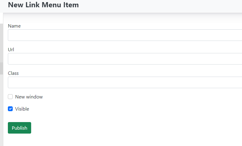
This feature allows you to insert a link to any external URL address.
-
Name — Enter the name for your menu item.
-
Url — Enter the web address where the link should point.
-
Class — Filling in this field is not required. It is used to add a CSS class for specific styling.
Checkboxes:
-
New window — if checked, the link opens in a new browser window. If unchecked, the link opens in the same window.
-
Visible — determines whether the menu item should be hidden or visible.
Save changes using the publish button.
Content Menu Item
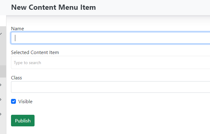
Add a page to the menu that was created directly in the website content you are managing. You are inserting a link to an existing page from content items.\
-
Name — the name of the item in the menu (displayed on the website).
-
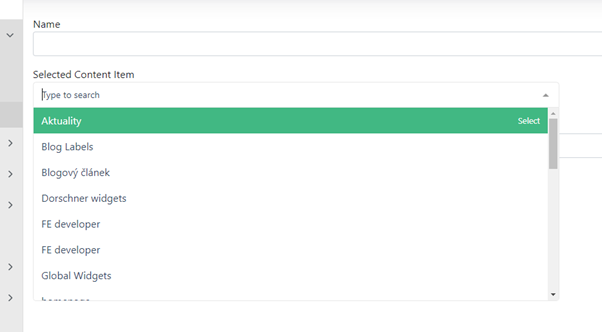
Selected Content Item — use the dropdown to select the page to which the menu will link.
-
Class — no need to fill in (otherwise you can insert a CSS class).
-
Checkbox: Visible — determines whether the menu item should be hidden or visible.
Save changes using the publish button.
Html Menu Item — not currently developed.
Megamenu Category Item — the megamenu function is not currently developed.
Ordering menu items:
After creating all the required menu items, all links are arranged below each other in the order in which they were created.
Using drag and drop you can move individual items and change their order.
You can also use this to place items into a "submenu".
If you want to place pages PUX and BLOG (shown in the previous image) under the menu item TEST, simply drag them and place them under that item. This will automatically create a submenu.
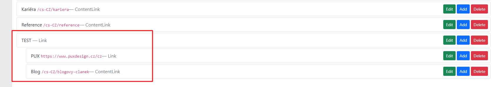
On the website the menu will look like this:

Important information
If you want to create a menu item that is not clickable and serves only as a heading for a submenu, create a new item of type "Link menu item". When creating it, do not enter any URL address and publish the item as-is.
All changes in the menu are saved using the publish button. If you are only preparing the menu and do not want to publish it yet, saving as a draft (save draft) is sufficient.
Menu actions
You create a menu in Content -- Menus.

For the created menu, you can also manage what happens with the menu.
The actions button opens a dropdown:
-
Unpublish — unpublishes the menu.
-
Delete — deletes the menu.
-
Clone — creates a copy of the menu.
-
Audit trail — change history (for developers).
-
Clone in Culture — creates a copy in the current culture.
Localised menu
If your website has multiple language versions, you can create a so-called localised menu for each language version separately.
-
Create a new menu.
-
Enter a title such as Menu en.
-
Enter an alias such as: en-US / menu.
-
Add the required menu items (in the given culture).
-
Save the menu.
Sections
To create and use widgets within a page, we first need to create sections for the widgets to be placed into.
Add a section to the page using the blue "+" button and then select "section" from the menu.
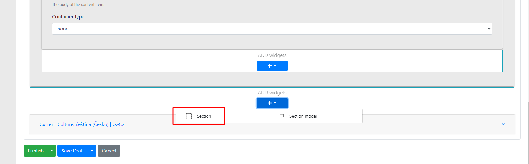
Within the section you have several options to configure:
-
Title → the name of the section; this name is only for orientation in the administration, so that when there are multiple sections, you know which one contains specific widgets.
-
Checkbox "use container" → used to set the section's padding from the screen edges.
-
Background color → background colour of the section.
-
Container type → when the container checkbox is checked, even larger padding can be achieved.
-
Line → setting a line (divider) below the section.
-
Animation type → used to set the animation for the section and its widgets.
-
Animation → setting what the animation applies to.
-
Items → individual items in the widget
-
Container → individual widgets
-
All → the entire section
-
Animation delay → setting how long before the animation appears.
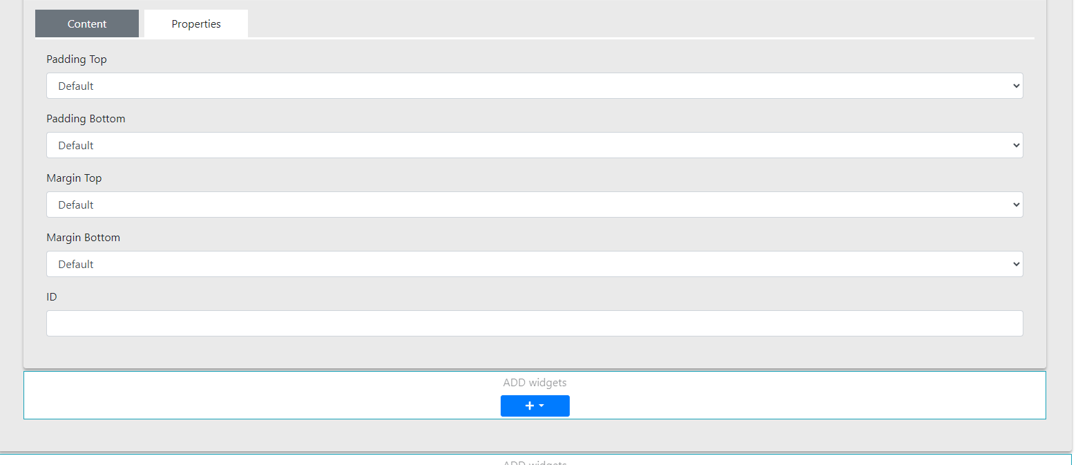
Properties tab
 \
\
In this section you can configure:
-
Padding Top and Margin Top — used to set the top padding of the section — selected from options in 10-pixel increments (range: 0 – 120 px)
-
Padding Bottom and Margin Bottom — similar to the above, but for the bottom padding of the section (selected from options in 10-pixel increments, range: 0 – 120 px)
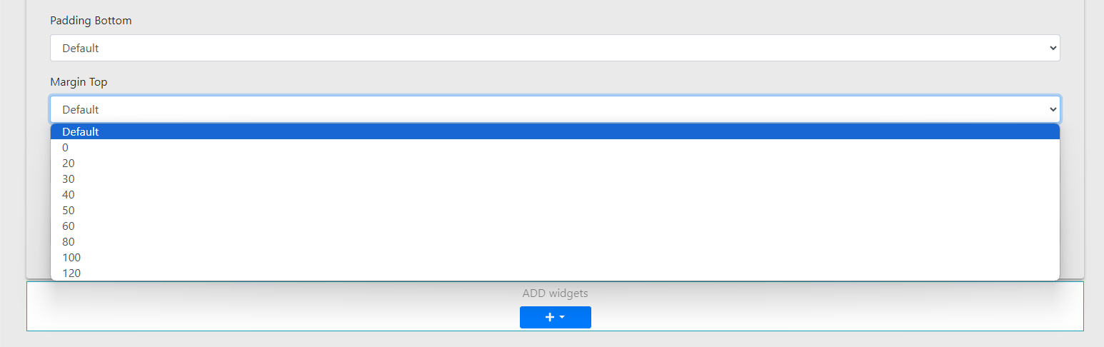
- ID is used to set an anchor (enter the anchor ID of the link from which you want to reference this section)
Finally, you can freely insert widgets into the prepared section.
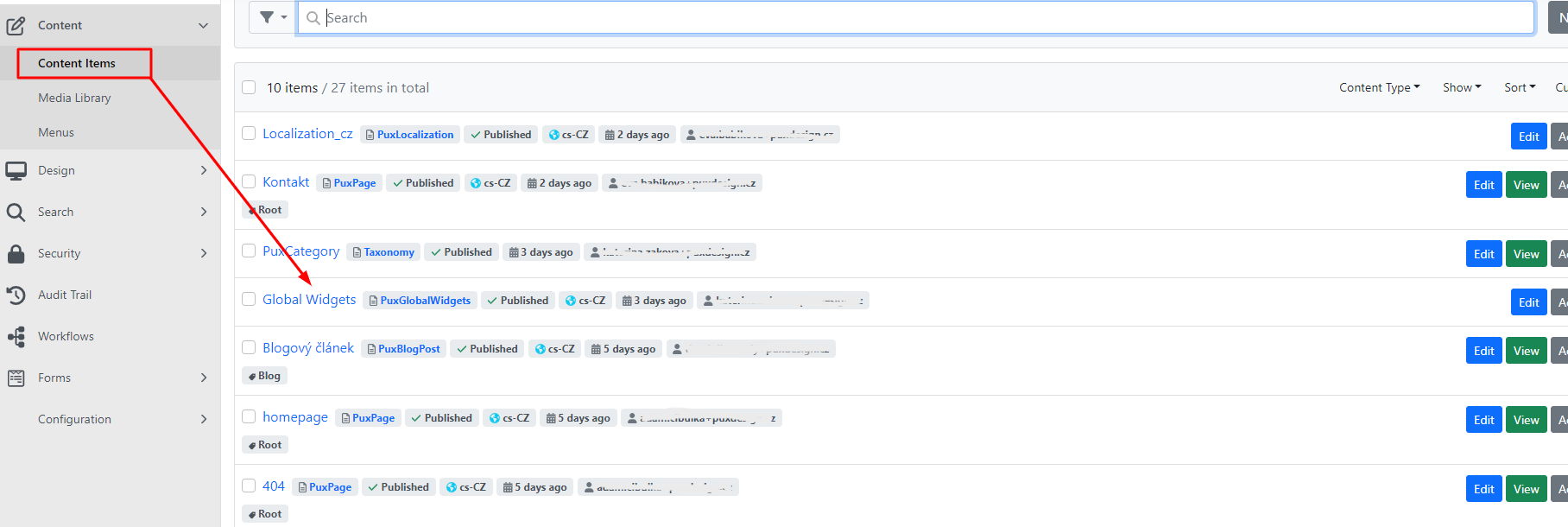
Content items
This part of the administration primarily concerns the website content itself.
This section contains in a row listing:
-
Content items — this section contains all the pages of your website. Here you can find regular web pages, blog posts, the 404 error page, GDPR information and more.
-
Localization — used for translating texts (so-called Resource Strings) on your website into different languages. For each language available in the administration, you create its own version of localization. More detailed information can be found in a separate guide.
-
Global widgets — primarily used for editing links and information in the footer. More in a separate guide.
-
Menu — in this section you can edit the navigation menu of your website. More information can be found in the separate menu guide.
-
PuxCategory — also known as taxonomy, allows you to sort and organise your website content into categories. More can be found in a separate guide.
-
Labels — similar to PuxCategory, used for creating and organising tags primarily for blog articles. More can be found in a separate guide.
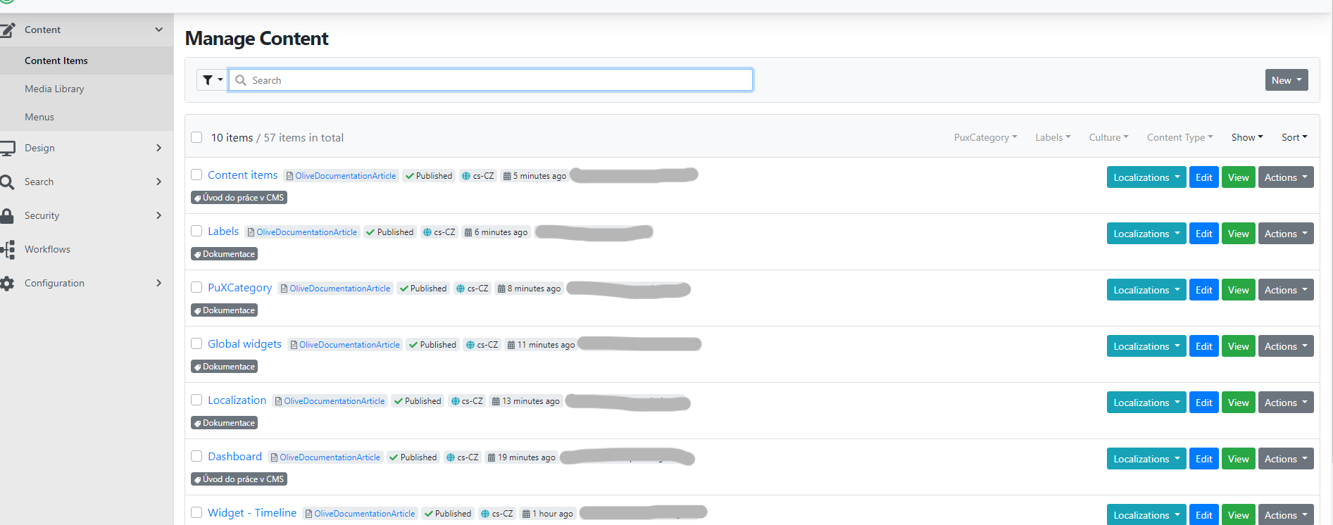
Each row contains the following information:
-
Page name — comes from the page title
-
Page type — also called content type. For example PuxPage, BlogPost etc.
-
Publication status — indicates whether the page is published (accessible from the website) or unpublished, i.e. a draft. A draft typically marks a working version of a page that cannot be accessed any other way than from the administration.
-
Localization — indicates in which language the page is prepared, e.g. cs-CZ for Czech, en-US for English, etc.
-
Date — shows the date/time of the last saved change to the given page
-
User — author of the last change to the given page
-
Label — category label (more in a separate guide)
Users
Users are created and managed in the Security -> Users section.
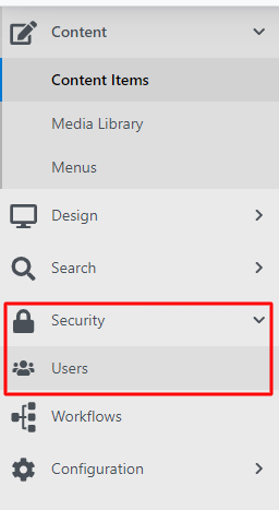
Clicking on Users takes you to an overview of all current users registered on the website.
In the overview you can filter using:
-
show — filtering displays enabled/disabled users.
-
Sort — changes the ordering of users by email or name.
Individual users can be managed using several buttons:

-
Edit — edit the user, their roles and password, see below.
-
Delete — you can delete the user from the administration.
-
Edit password — set a new password here.
Creating a user
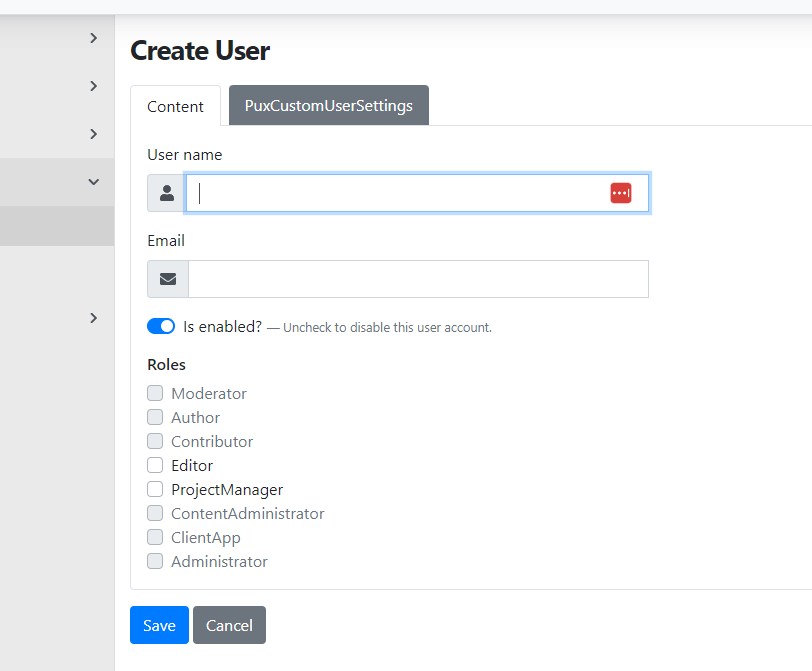
Create a new user using the "Add user" button in the top right corner above the user list.
You will now go directly to the user's settings, where you need to fill in:
-
User name — username (enter without diacritics).
-
E-mail — the user's email address.
-
Is enabled — here you can activate or deactivate the user account.
-
Role — in this section you assign user roles. Most commonly editor or project manager, or administrator.
Roles
Based on the assigned role, the user can see or edit limited areas within the CMS.
You can set roles:
-
Editor — has permission to edit content and publish articles.
-
ProjectManager — responsible for planning and managing projects.
-
Administrator — has full access to the system and its settings.
-
Helpdesk — provides user support and resolves incidents.
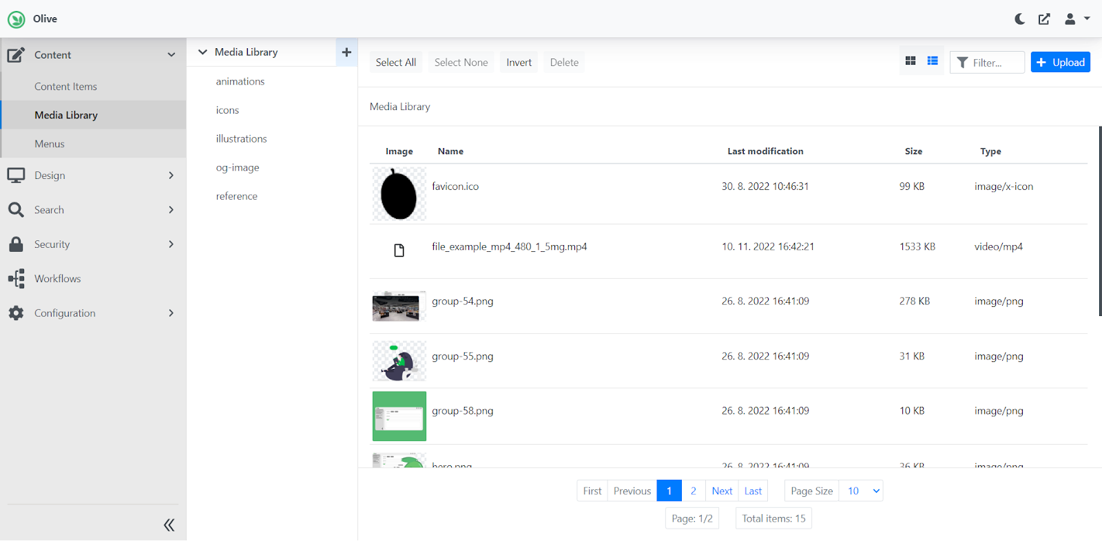
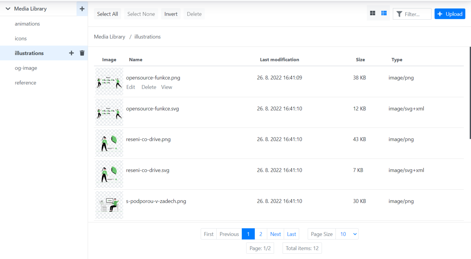
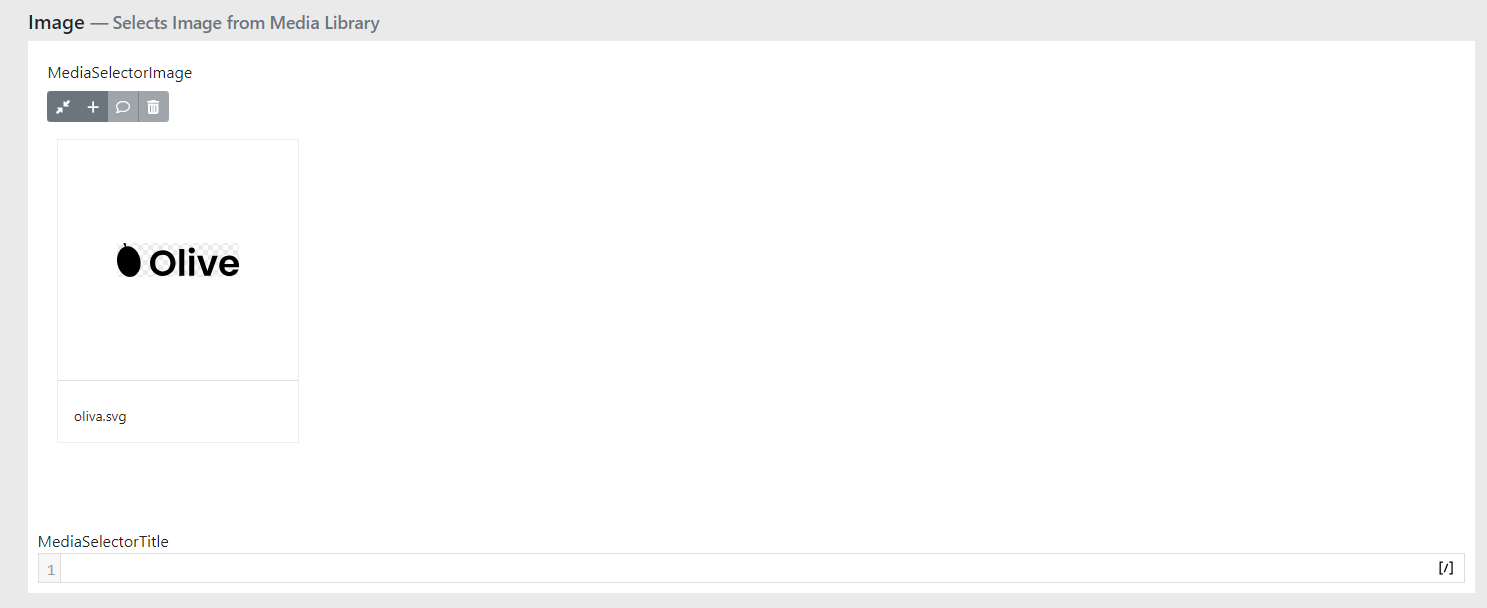
Media Library
Media Library is a media library where you upload files such as: images, logos, animations, videos or PDF files. These are all the files that you can use on the website.
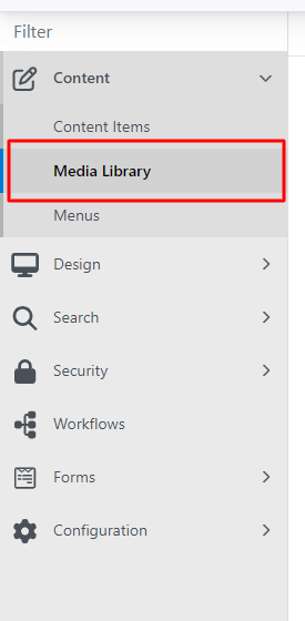
In the administration, find Media Library under Content / Media Library.
Media Library then looks as follows:
Editing / viewing the environment
Files can be uploaded to the library using the upload button in the top right corner.
You can also upload by selecting files from a folder on your computer and dragging them over the Media Library window.
Files can also be filtered — by entering the file name or extension in the filter field.
The display of uploaded files can be switched from a classic list to a grid. Make this change using the two pictograms on the row next to the filter field.
You can bulk edit files using select all/select none and then for example delete them using delete.
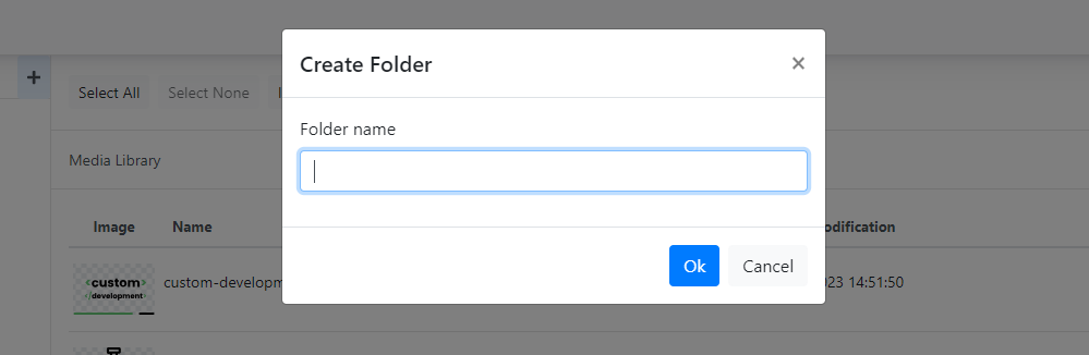
Creating subfolders
Subfolders can be created within the library using the "+" pictogram.

Enter the name of the new folder and save the changes.\
If you want to view all files in the Media Library, i.e. from all folders, just click the down arrow.

To delete a folder, simply click on the folder you want to delete and then click the bin icon.\
Editing individual files

Each file has 3 options:
-
Edit — used to rename the file
-
Delete — used to delete the file
-
View — used to view the file in a new window
Files can be moved using Drag & drop — by dragging the file with the mouse.
Dashboard
After logging in to the website administration, the so-called dashboard is displayed.
In the left section you will find the administration menu.
Content is divided into three parts and mainly concerns the content section:
-
Content items — here you will find all the pages that exist on the website.
-
Media Library — this is where all the images you want to insert on the website are stored.
-
Menu — in this section you change and add the menu structure.
Security → Users
In this section you can see all users with access to the given website.
You can adjust their permissions, revoke access or change their password.
Other tabs are primarily for developer purposes and are not intended for regular administration users.

In the top right of the administration you can configure the following:
-
Moon icon: dark / light administration mode.
-
Square with arrow icon: clicking opens a new window with the administration (the production website should open).
-
Person icon: Here you can configure the logged-in user's profile (roles etc.), change your password or log out
of the administration.
Working with content
How to translate existing pages
Creating a page in another language version involves several steps:
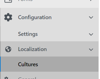
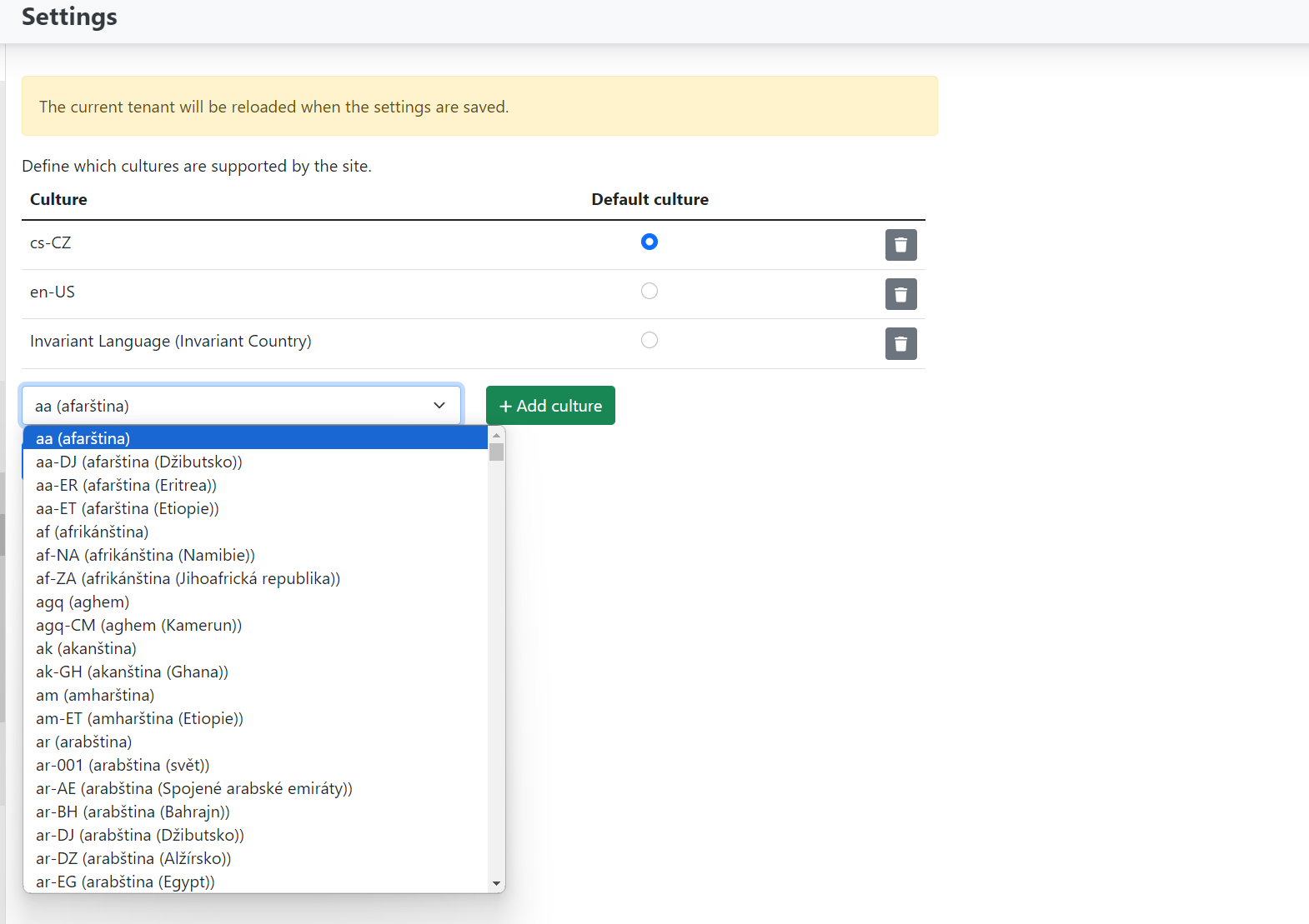
- In the settings under localizations, add the culture (if not already added):
- Configuration -> settings -> localization -> cultures
If only the default language Czech (cs--CZ) or English (en--US) is enabled, you need to add another language. Be careful not to change the default language if it is already set. Select the desired culture from the dropdown and save.
Now go to content items and select the page you want to localise — translate into the given culture.
On the selected page in the overview there is a "Localizations" dropdown. After clicking it, the cultures you selected in settings will be offered.
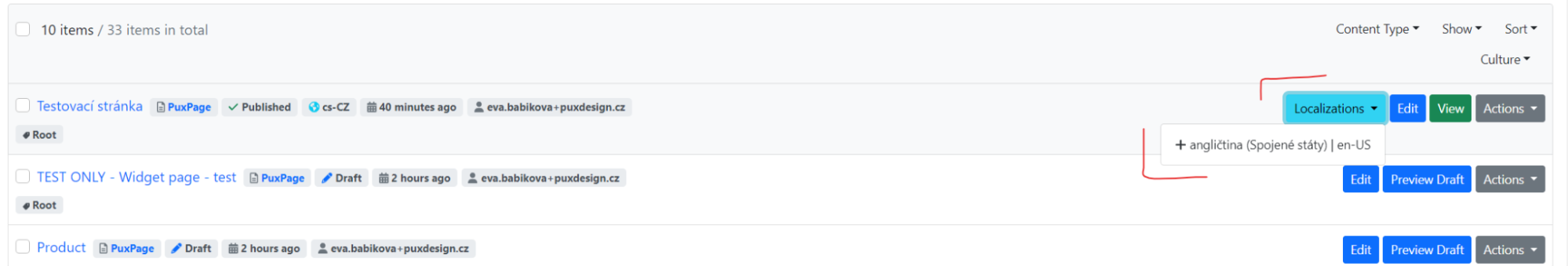
Clicking on the selected language will create and open a page already created in that language (a notification of the localised page creation will appear at the top).
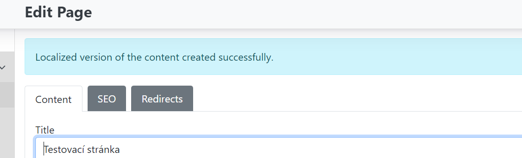
Now edit/translate the page Title, page alias, widget content etc. Before saving, also check "refresh path" so the URL is set to the new culture, then save.
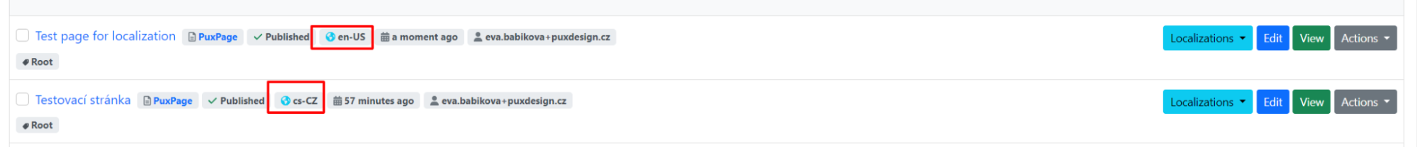
The localised version of the page has now been created. In the page overview in content items, you can see that each page also has its culture label.
Creating a category / tag for pages and articles
Categorisation is used to organise the structure of pages in the CMS.
Creating a category
You edit / create categories in Content items, primarily in PuxCategory:
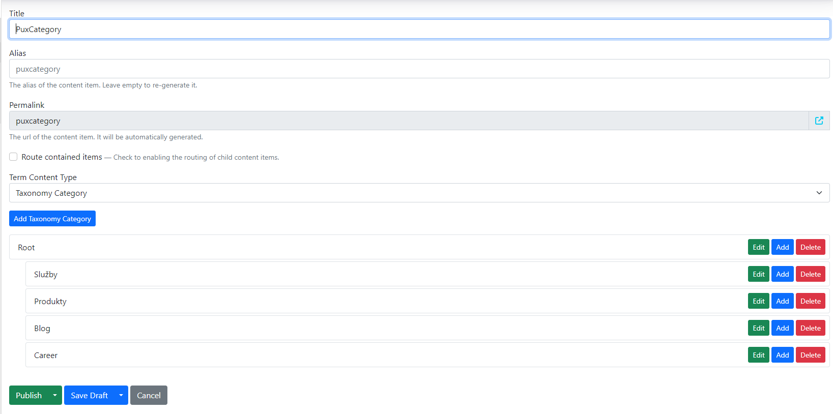
Adding a new category
Using the "add taxonomy category" button, you create a new category.
Fill in:
-
Title — category name
-
Link — enter the link to the page that represents the given term.
For example, in the image below, the item named "FAQ" represents the category on the website named "FAQ". Select the link to this category.
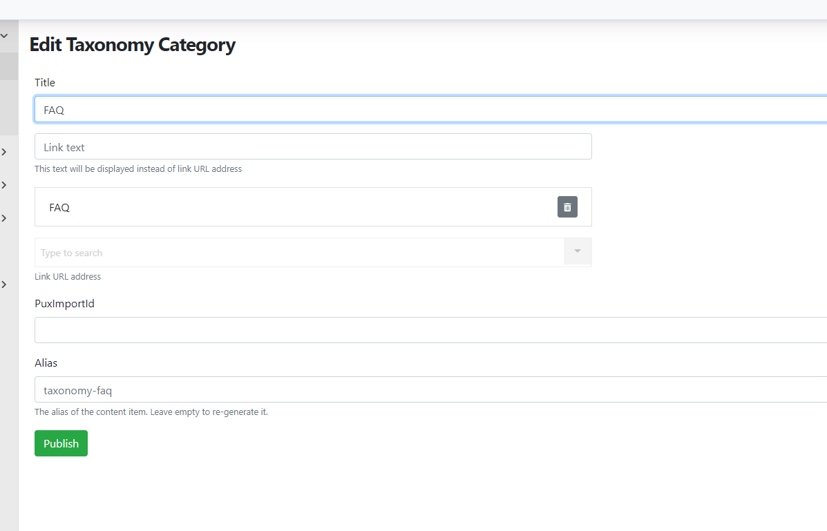
After making changes, save/publish again.
Individual categories can be moved and nested.
The structure then allows us to generate localised addresses and breadcrumb navigation.
Creating a tag (for blog, news, etc.)
Another type of categorisation is tags for blog articles, news etc. This is used when content of this type needs to be filtered in some way.
This type is often used for blog articles, where each article can have its own tag (or multiple tags), for example: news, event.
Search in content items -> Labels. There can be multiple Labels and they are distinguished by template. E.g. reference -> reference labels, career -> career labels etc.
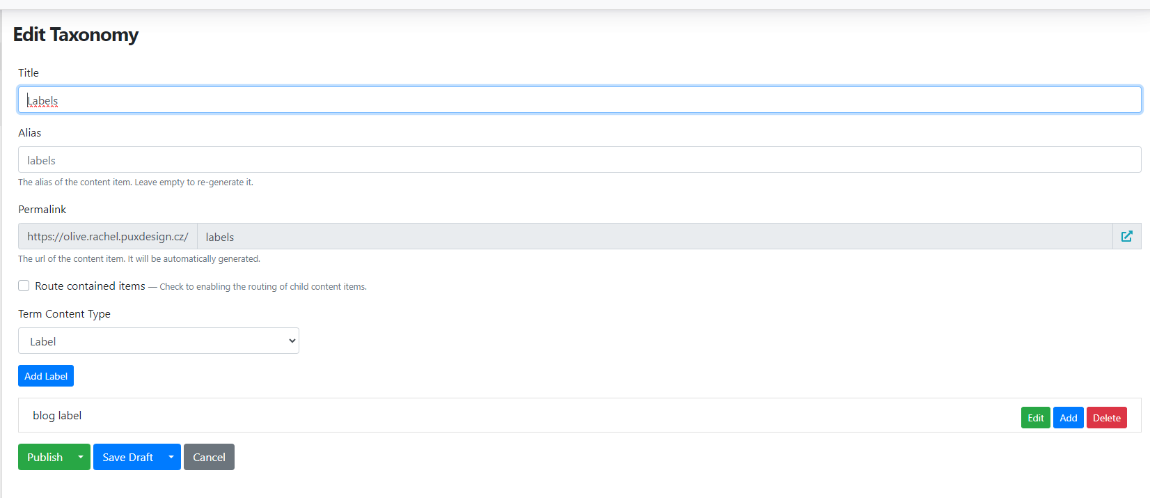
Create a new tag using add label.
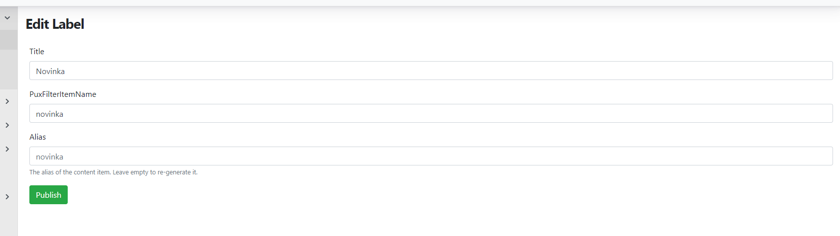
Fill in:
-
Title — tag name
-
PuxFilterItemName — determines the form in which the value appears in the URL address when filtering
-
Alias — is generated automatically after saving; no need to fill in
After making changes, publish both the edited tag and the page with the tag structure.
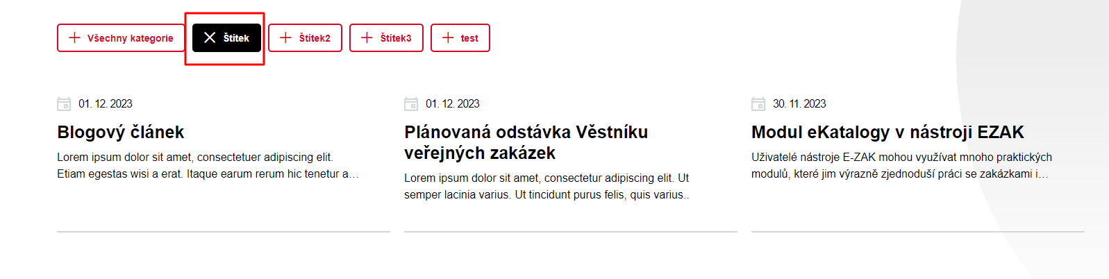
Tags created this way can then be added to blog articles.


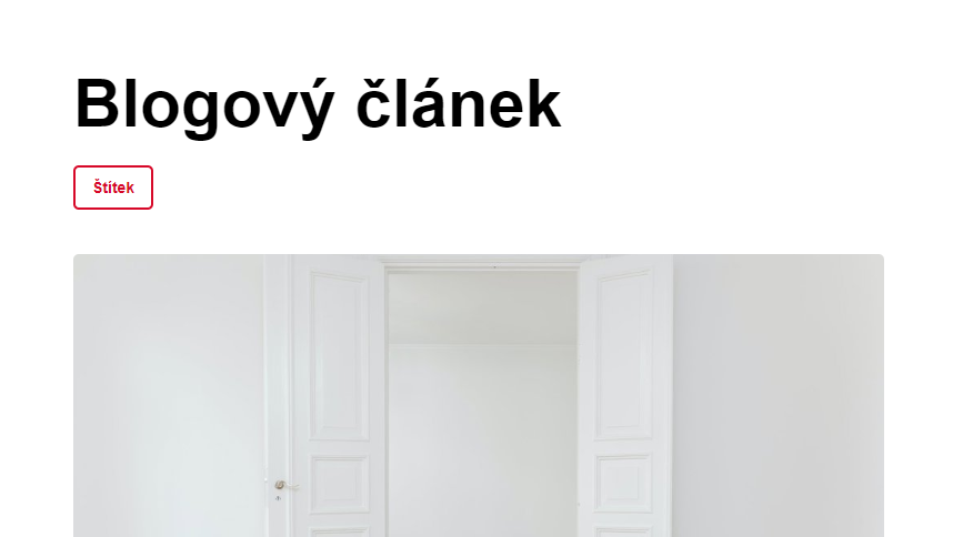
Creating a blog article / reference
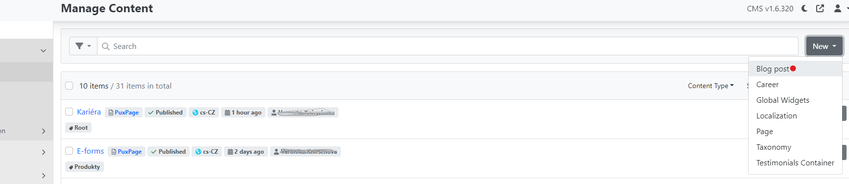
In content → content items, select "new" and choose the blog post option.
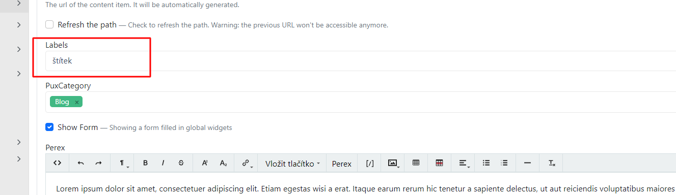
After creating the page, it is necessary for blog articles to also select a tag.
This will then be displayed on the website alongside the article and can also be used to filter the display of articles.
In the administration:
On the website:
Article listing with the same tag:
Title — article name
Alias:
-
used to identify the article and is added for example to the URL address
-
do not fill in at all. It is automatically set after the first save based on the name.
Creating a page and managing it
Create new pages in content → content items.
New pages can be created either as a copy of an existing page or as a completely new page.
Copy of an existing page
In the content section, select or search for the page you want to copy. This depends on your goal. If you have an existing page that you want to copy content-wise or edit, copying a page is a good option. Pay attention to what type of page you are copying (page type). Each page type is used in specific cases.
Create a copy of a page by finding the specific page and using the "actions" button to select clone.
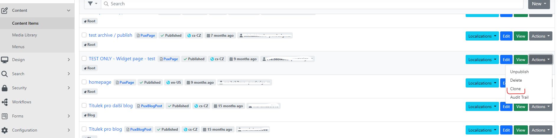
After clicking clone, a copy of the original page is immediately created and saved as a draft.
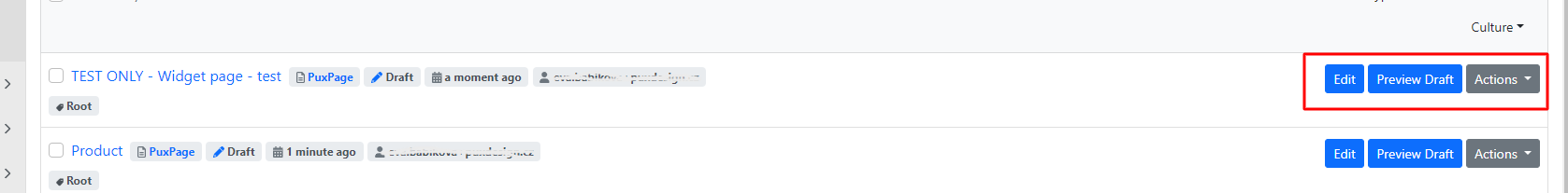
You can preview the draft page using Preview draft or edit it using edit.
When working with a copied page, keep the following in mind:
-
Update the alias
-
Create completely new pages
Create new pages again in content items — next to the search field there is a "new" dropdown with several options.
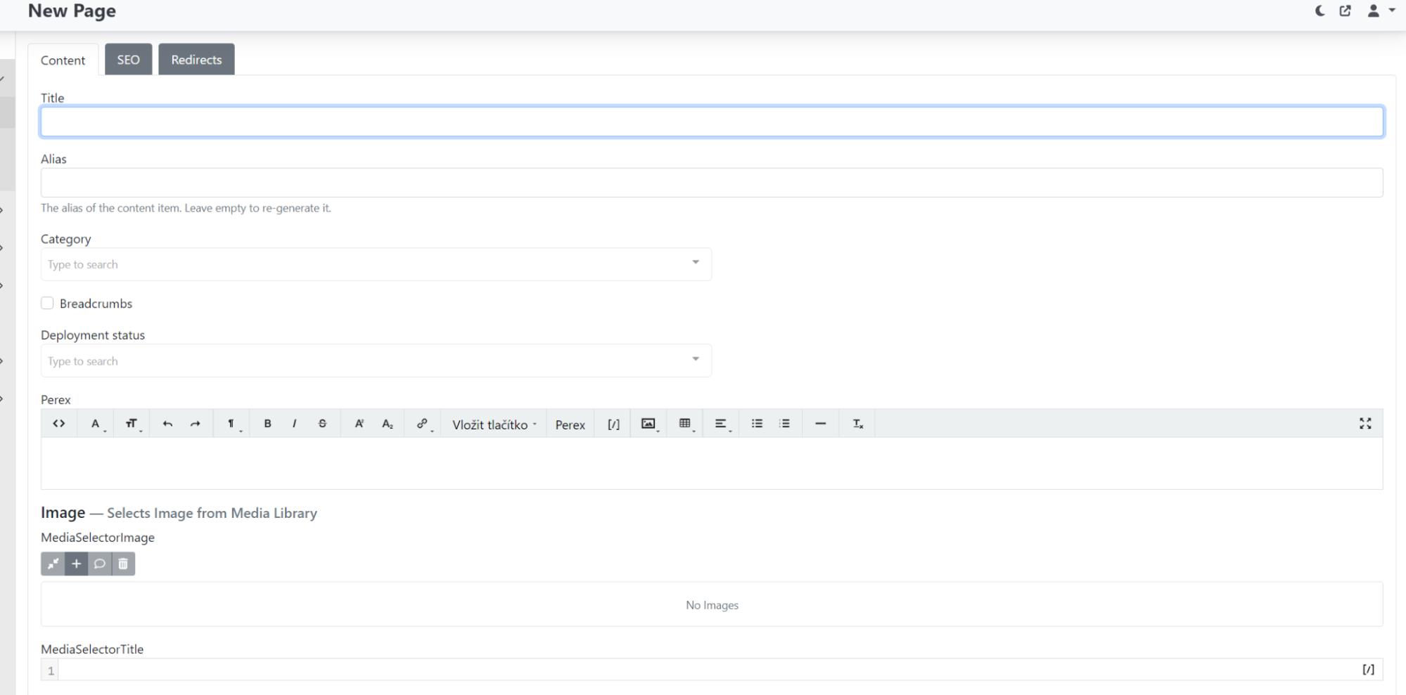
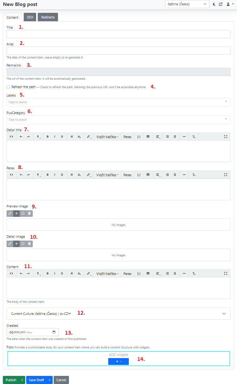
In content fill in:\
-
Title — page name in CMS,
-
alias (can be left empty, can be overwritten later),
-
category — select the page category (whether it is a regular page, blog post, product detail, etc.),
-
breadcrumbs (checkbox for showing/hiding breadcrumb navigation),
-
page perex,
-
image.
SEO
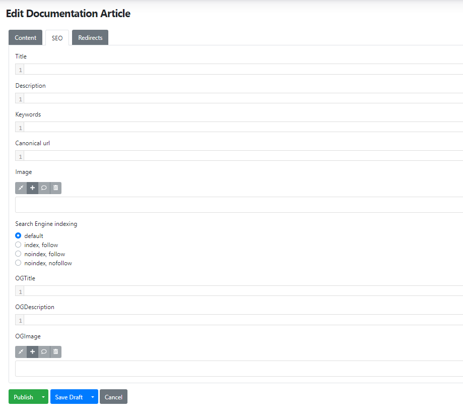
In the SEO tab you can fill in custom metadata for individual pages.
Options to fill in for each page:
title, description, keywords, canonical url, image, search engine indexing, ogtitle, ogdescription, ogimage.
Sections and widgets — configured on the page using the blue "+" symbol.
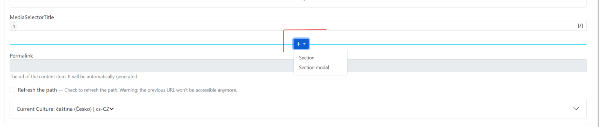
The most commonly used option is "Section".
After selecting a section, you can choose individual widgets for the section based on the desired display on the website.
Permalink — do not fill in; it is generated automatically.
Save the prepared page (either as a draft or publish it).
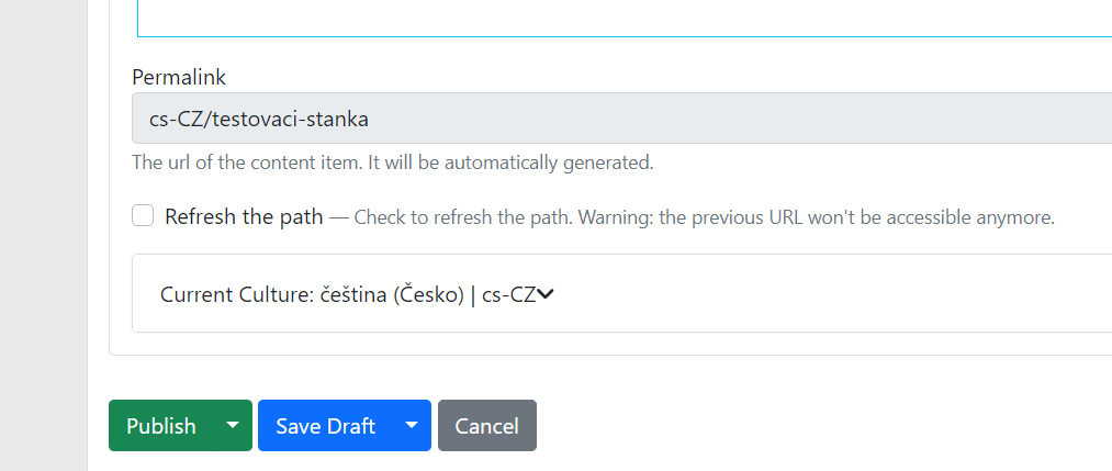
If you change for example the page title and want the URL address to change too, check the "refresh the path" checkbox. After saving, the link will be regenerated based on the filled-in title.
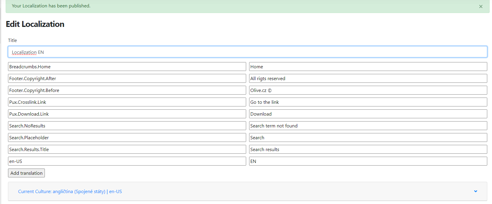
Localization
Localization page / resource string translation
Localization is used to translate system texts. For each language version on the website, a separate localization must be created. So if you have languages cz, sk and en, each language will have its own localization page.
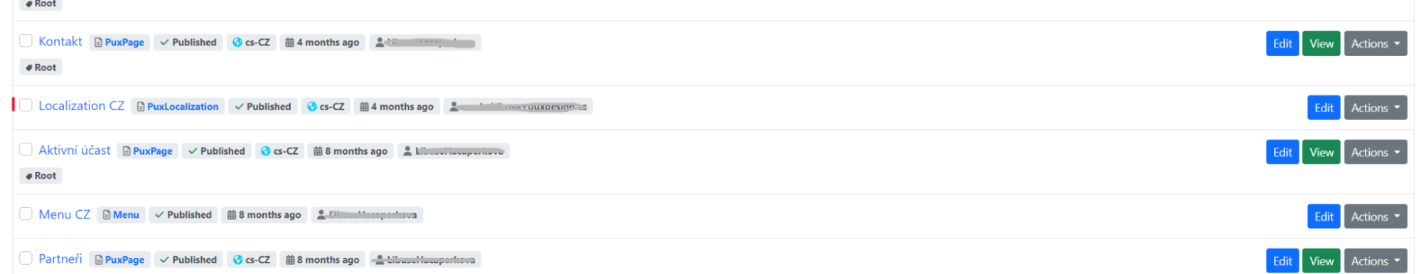
You can find Localization in Content -> Content items:
The localization page contains the resource string on the left side, for example "Footer.Copyright.After", and the translation on the right side, e.g. "All rights reserved."
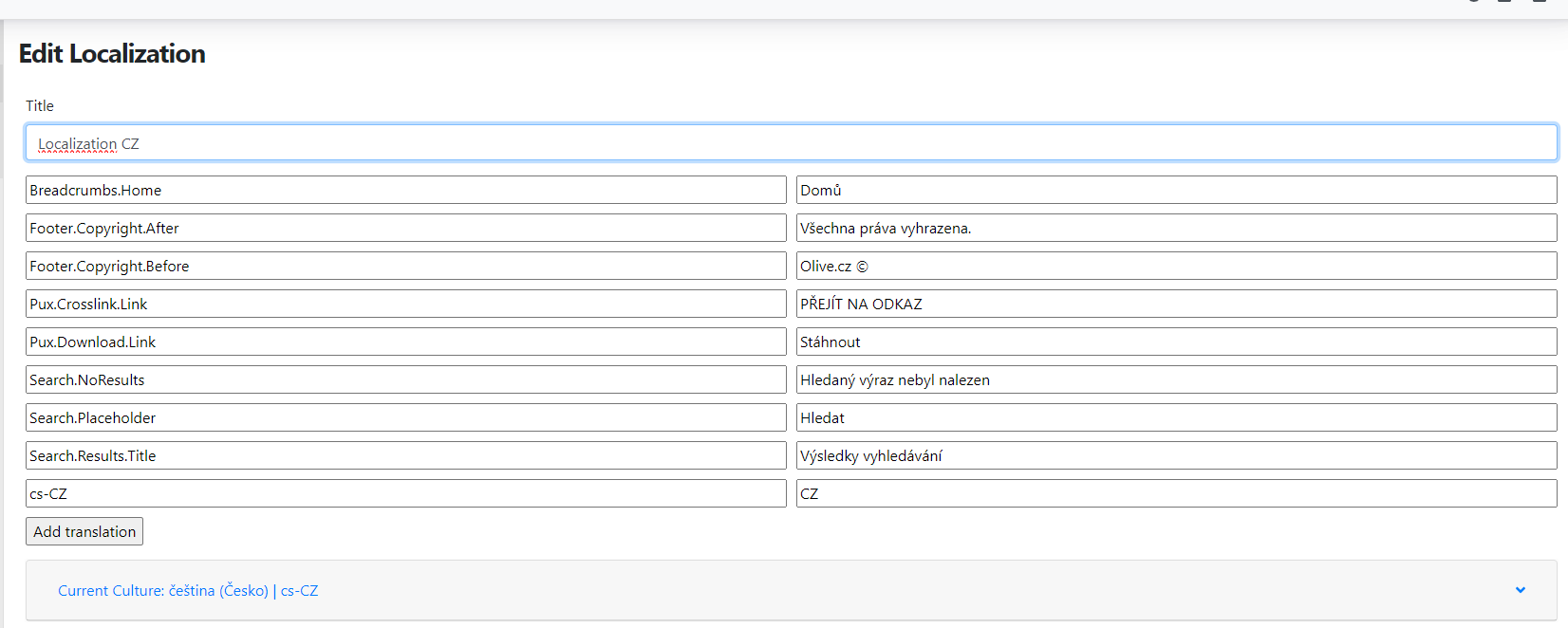
Add additional strings using the "add translation" button, where you fill in the string and its translation. Always save edited or newly entered strings.
For the resource strings themselves, capitalisation must be maintained, see the image above. For translations of individual strings this is not required. The translation and capitalisation you enter will appear on the website exactly as written.
Localization for additional languages
By default, the CMS already has a localization page prepared. The main language of the website determines the base (Czech, English, etc.). To avoid creating a new page for each additional language version, you can use the option to copy it to the given language. Similarly to regular pages, you create a localised page with resource strings. Click the Localizations button and select which culture the page should be created in.
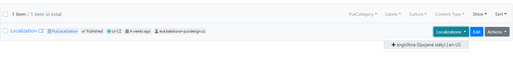
Name the newly created page for example Localization EN. You then need to edit the string translations, i.e. translate the terms into English.
Widgets
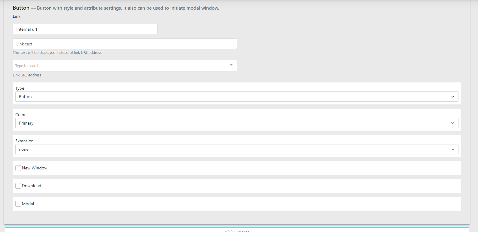
Button
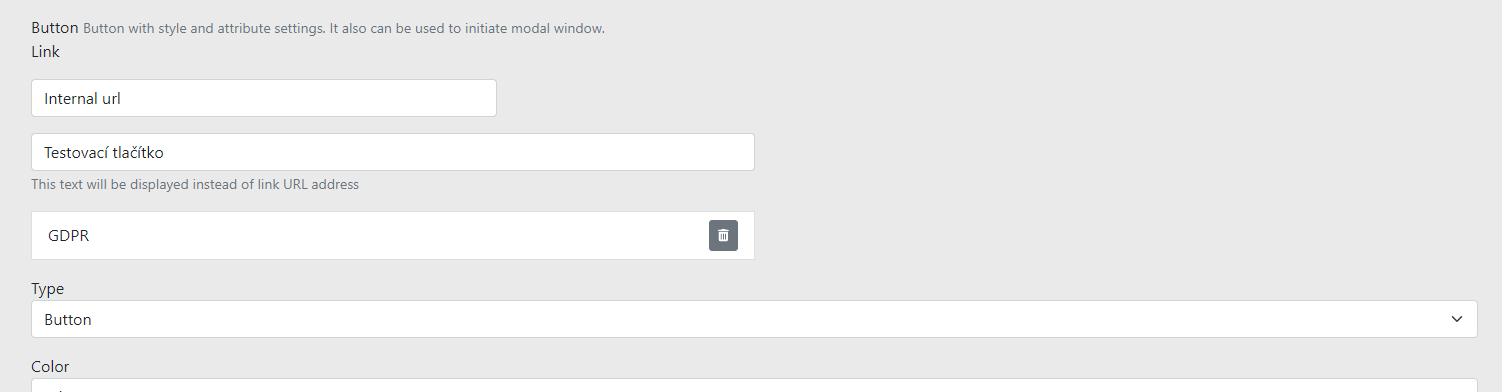
Button is a component used in widgets. It allows you to configure the button differently in each widget. Here is the full component which we will go through point by point.
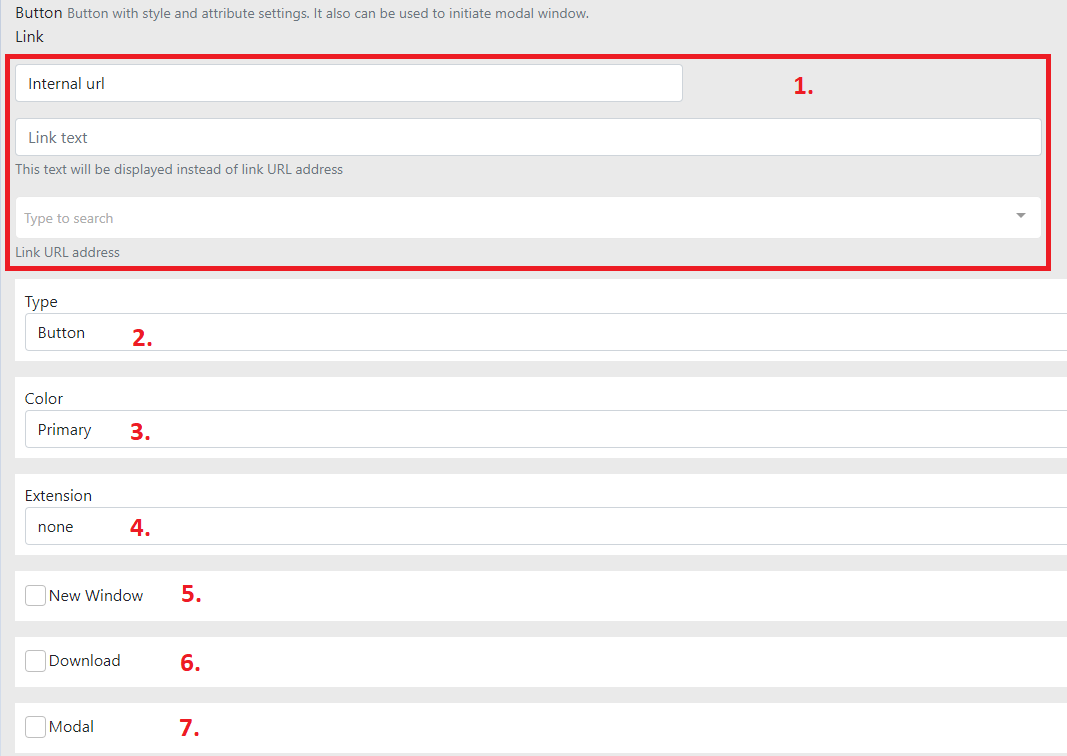
-
Choose whether to use an internal or external link
-
Internal — link within the website
-
In the "Link text" field, enter the button text.
-
In "Type to search", select a page from the website.
-
-
External
-
Again, enter the button text.
-
In "URL address", enter the desired link.
-

-
-
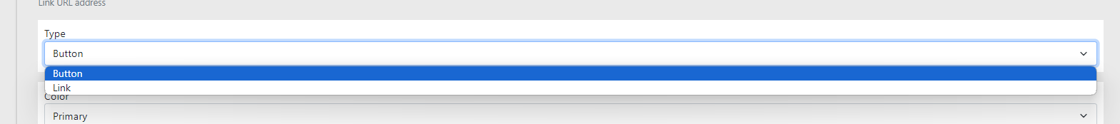
Type — select the type (button or link)
-
Button — button
-
Link — link
-
-
Color — colour variant
-
Primary
-
Primary button for the website.
-
Usually prominent.
-
-
Default
-
Second type of button.
-
Less prominent in colour.
-
Sometimes not used at all (depends on the design).
-
-
-
Extension — extension
-
Arrow — right arrow
-
Back — left arrow
-
Scroll — down arrow
-
-
New window — open in a new window
-
When checked, the link opens in a new window.
-
Generally used when the link leads outside the website. Sometimes it also makes sense within the website.
-
-
Download — file download
-
When checked, file download is activated.
-
The user can then download for example a PDF file.
-
Use the external link type and fill in the file address.
-
-
Modal — popup window
Widget - Iframe
If you are not familiar with iframes, no need to worry. An iframe is a pre-prepared type of code that you simply insert into the website and it works without any further configuration. Good examples are Google Maps or YouTube videos. You can recognise an iframe for Google Maps quite easily. On most websites you can find it as a small map preview in the contact section.
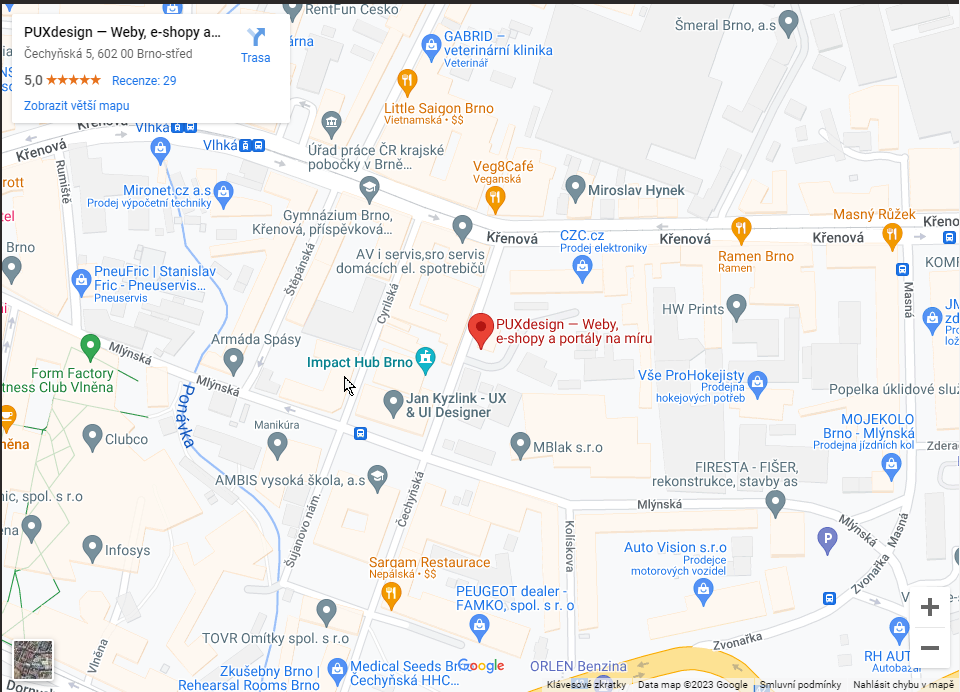
An iframe for a YouTube video is also familiar from articles where you see a video preview and after clicking it starts playing as if you were on YouTube directly.
We have created a special widget for even simpler use of iframes, which we will go through together.
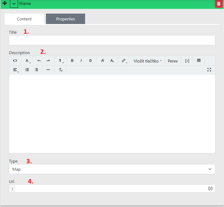
Widget content
Title — name for orientation in CMS
Description — editor for heading and perex to display above the iframe
- The heading should be H2 size.
Type — iframe type
-
Map
-
Video
-
PDF
-
Other
Url — address entered according to type
-
Map
-
Video
-
PDF
-
Other
Widget - Repeater
Repeater is a special widget for listing pages. We can easily illustrate it using a blog. Here we have cards with a listing that contain an image, name and short text. This listing is performed by the repeater. By default it works precisely for the mentioned blog. If a similar listing is used in the design for other page types, e.g. career, products, this listing is prepared specially for each type. Listings must be prepared separately because they may have differences.
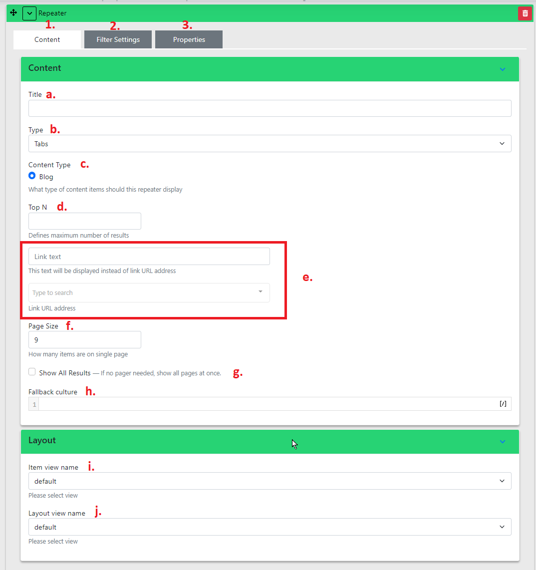
Widget content
a. Title — name for orientation in CMS
b. Type — display type
c. Content Type — template type
-
By default the CMS has Blog prepared
-
Repeater is practically used for classic listing types. Can also be used for career, products, etc.
d. Top N
-
Defines the maximum number of results per page that you want to list.
-
Can be used when you want to use the repeater to list e.g. 3 items and do not want to display a "load more" button.
e. Link text and Link URL address
-
The button does not serve as load more, but as a link to a page with a larger listing.
-
The ideal combination is with Top N. Set the maximum number of displayed articles to 3 and then fill in the button text and link that takes you to the page with the complete blog listing.
-
Link text — text on the button
-
Link URL address — link to the target page within the website
-
f. Page Size — number of items per load
a. If there are more items on the page than currently displayed (and you have not filled in Top N), a "Load more" button is available. This value determines how many items are loaded initially and how many are loaded after clicking "Load more".
g. Show All Results — show all
-
In some cases you do not want to use the load more option at all. This checkbox is exactly for that.
-
This option should be carefully considered. If you display all items and there are many of them, the page loading time can multiply. That is exactly why the "Load more" button was developed.
h. Fallback culture
i. Item view name — template for listing items
-
In some cases you may have multiple listing template options.
-
For example, you may want to choose between classic blog cards (image, date, name and perex) and a shortened version without an image (date, name and perex).
j. Layout view name — template for detail
-
Here you may have multiple templates available for article detail.
-
We have encountered cases where a client wanted 2 types of article templates. They had a large template with a widget zone and then small informational articles that were visually different.
Widget - Testimonial
Testimonial is most commonly used for client references or employee profiles.
In the section, select Testimonial Container.
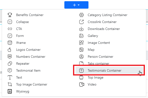
Below the Perex you will find the "Add Testimonial Item" button.
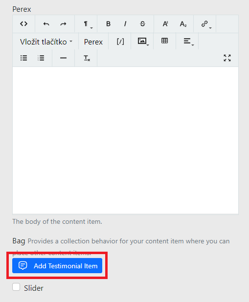
Now fill in the testimonial itself:
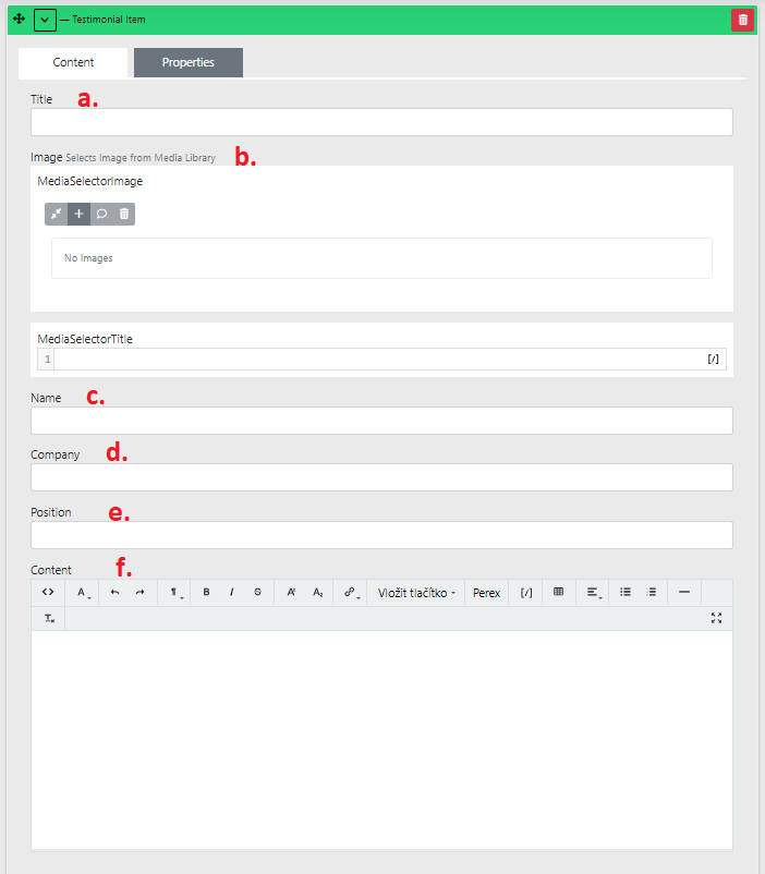
a. Title — again for orientation in CMS
b. Image — the image is usually a photo or company logo. Depends on what exactly you use the widget for.
c. Name — name
d. Company — company name
e. Position — position
f. Content — description
Widget - Person
In the section, select the widget Person Container.
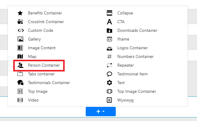
Click "Add Person Item".
Important fields: "Title", "Post", "Email", "Phone" and "Image":
-
Title — name
-
Post — position
-
Email
-
Phone — phone number
-
Image — picture (photo)

Widget - Numbers
In the section, select the widget Numbers Container.
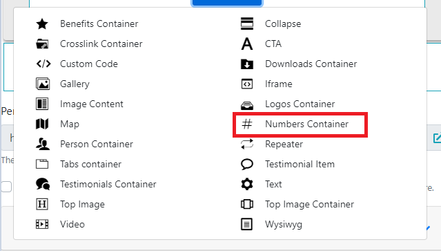
Below the Perex, click the "Add number item" button.
The fields of interest here are "Number", "Unit" and "Text":
Number — the numeric value
-
Enter the numeric value here.
-
The number must be in the format (TODO: to be filled in).
Unit — unit
- The unit is displayed next to the number.
Text
- Supplementary information displayed below the number.
Widget - Logos
In the section, select Logos Container.
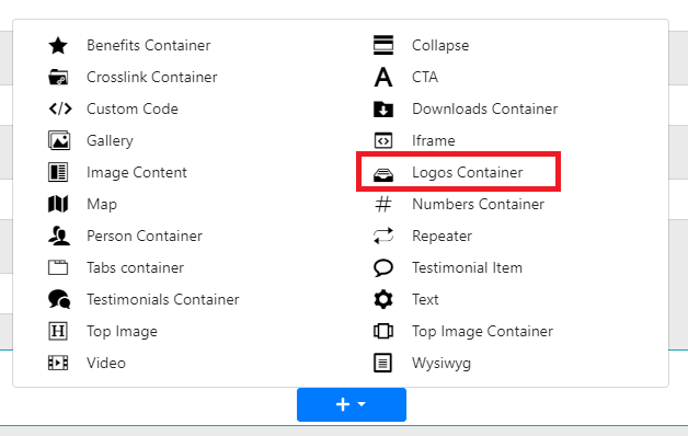
Below the Perex you will find the "Add Item" button.
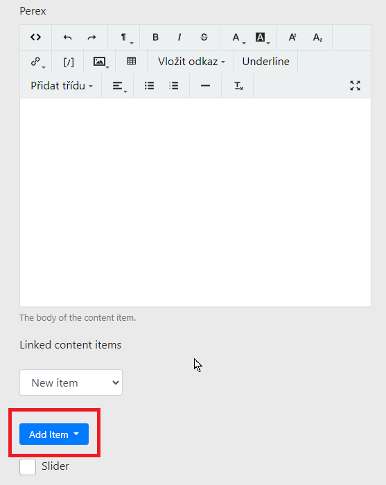
After clicking, select the "Logo Item" option.

The important fields here are "LogoImage" and "Url":
LogoImage — Logo image
-
Insert the desired image here.
-
The ideal logo format is SVG.
-
Always better to use a larger image than a smaller one. We have automatic image processing so the ideal size is always displayed. This means a large image will be scaled down. If you insert a small image, it will be scaled up and will appear blurry.
-
Recommended image size is at least 300px wide and 100px tall.
-
If you have trouble uploading an image, go to the Media Library guide.
Url — logo link
-
Fill in the link only if you have a page on the website to link to, or to an external page.
-
You do not need to fill in link text here.
-
Select "Internal url" (internal link).
-
You do not need to copy the address anywhere; find it in "Link URL address".
-
If the link leads to an external website, select "External url".
-
A new "Link URL address" field will appear.


- Insert the link here.
Slider — below the "Add Item" button you have the option to enable the Slider.
- If not enabled, logos will wrap every six per row.
Or you can enable the slider.
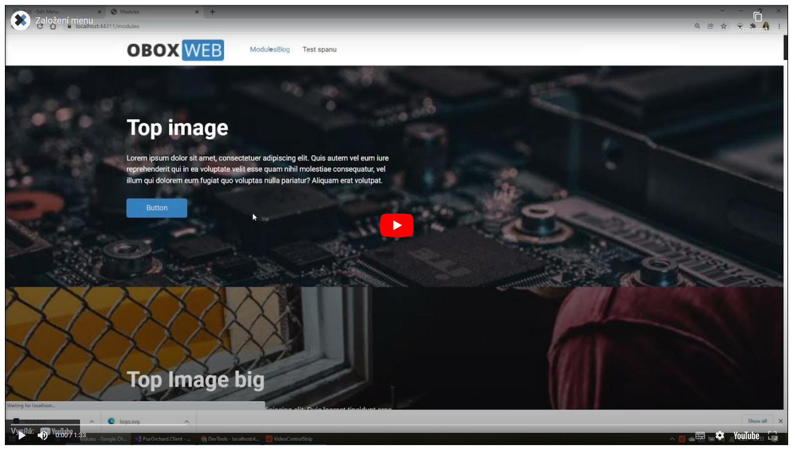
Widget - Top image
The Top image widget is a key part of a web page, located below the main menu.
Its purpose is to capture the user's attention with engaging content and an aesthetically appealing image at first glance. A well-filled Top image can influence the user's decision whether to stay on the page or leave.
We recommend having one Top image on a page; alternatively, the widget can be configured so that individual images in the Top image rotate — this is the so-called slider setting.
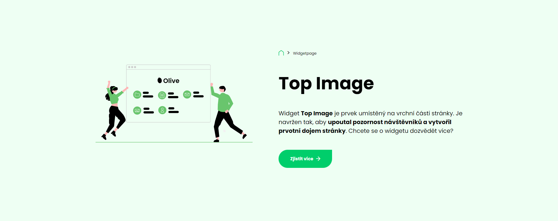
In the administration, on the given page, create a new section and select the Top image widget.
After opening the settings, you can edit the following items:
1. Title — description/name for better orientation within the page
2. Background — background image
3. Content — enter the text content here (this is a classic wysiwyg, a more detailed description can be found here)
4. Button — the button displayed below the filled-in content
5. Overlay — if developed within this widget, overlay adds for example a colour tint over the selected image
6. Breadcrumbs — allows showing/hiding the breadcrumb navigation
7. Style — select the Top image style here
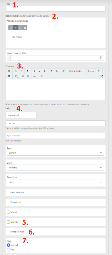
-
normal — standard Top image height — width is determined by the section width
-
big — in this case the height is approximately 30 px more than in the normal type
Labels
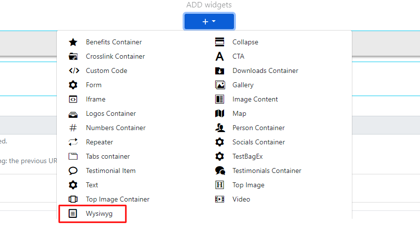
In the widget selector this is called Wysiwyg.
It is a text field that can be further edited.
The widget contains:
-
Title → used for orientation in the administration.
-
Content → used for displaying texts / images / buttons / links on the website.
-
Container type → setting the container padding from the screen edges.
Explanation of the wysiwyg panel:
-
<>→ display HTML code -
← go back one step in edits
-
→ go forward one step in edits
-
¶ — option to set text size / H1, H2, H3...
-
B — bold the text content
-
/ — set italics for the text content
-
Del — the selected text is struck through
-
A — set text colour and text background / set smaller text above or below the text
-
Link — add a link to selected text, which can link anywhere.
-
[/] — insert shortcodes using this (link to be added)
-
Image — insert an image
-
Table — insert a table
-
Add link — add a button to the text field
-
Underline — underline the selected text
-
Add custom class — additional text change options depending on the project
-
Align — text alignment
-
Unordered / ordered list — configure lists
Global widgets
Global widgets can be found in content → content items.
Clicking on it expands the following menu:
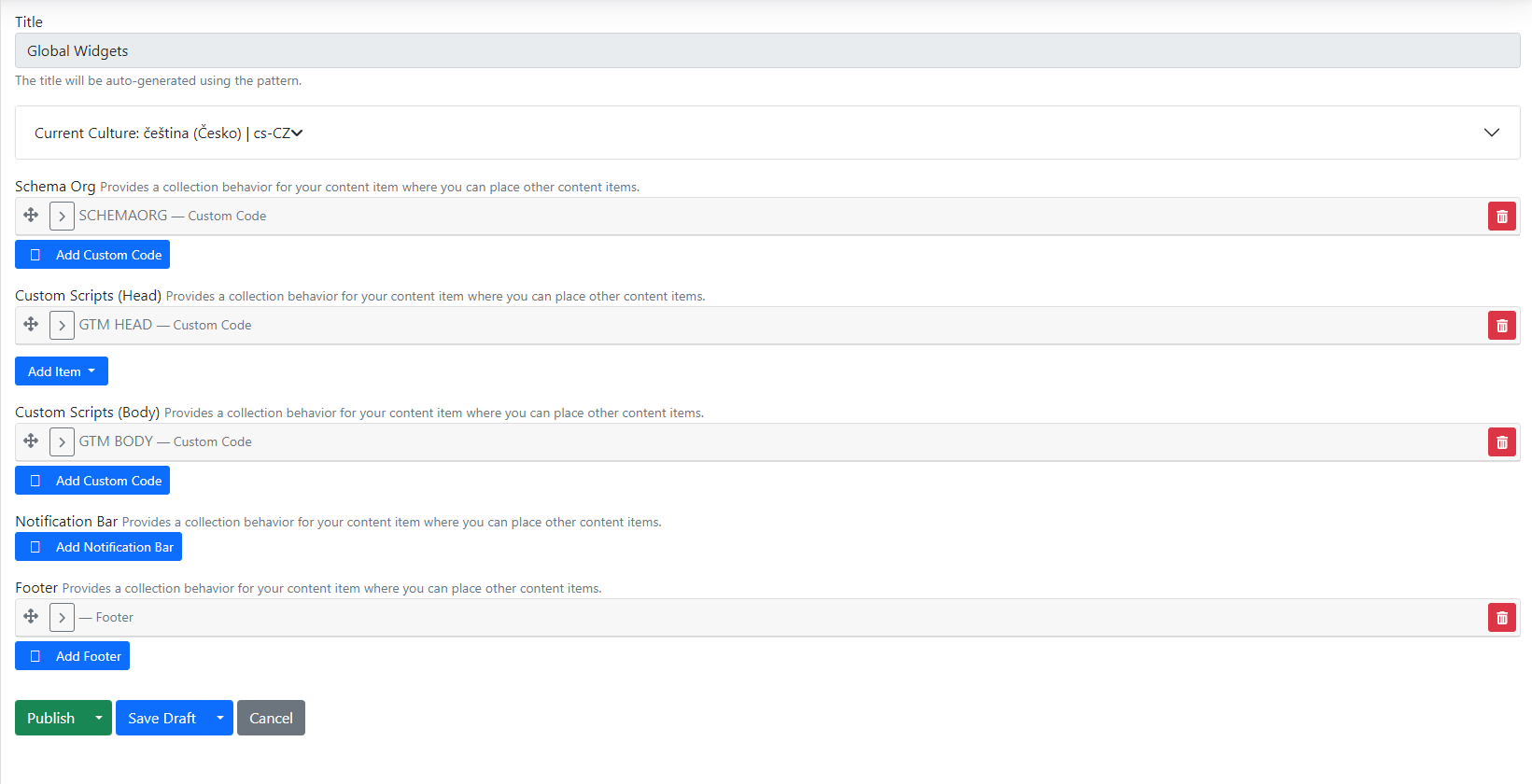
By default, global widgets contain general items such as:\
\
-
Schema Org — structured data for web pages.
-
Custom Scripts (Head) — here you can insert for example Google Tag Manager script head, Google Analytics and more.
-
Custom Scripts (Body) — space for inserting scripts into the website body.
-
Footer — footer.
-
Socials
-
Here you add and edit social networks.
-
Fill in the title (name), type (we have pre-prepared icons based on the design) and URL (link to the profile).
-
-
Logo
-
If you use a logo in the footer on the website, you can edit it here.
-
Individual columns in the footer (left, center and right) are displayed in this order. Columns may not always align — it depends on the design type. Sometimes only two are used and sometimes five, and additional ones need to be created.
-
The last item is copyright. Here you edit the part of the text that is always displayed at the very end of the footer columns.
-
Widget - Section Modal
For buttons in widgets, we have the option to check the Modal checkbox, also known as a pop-up window.
We will demonstrate how to set up a modal using the CTA widget as an example.
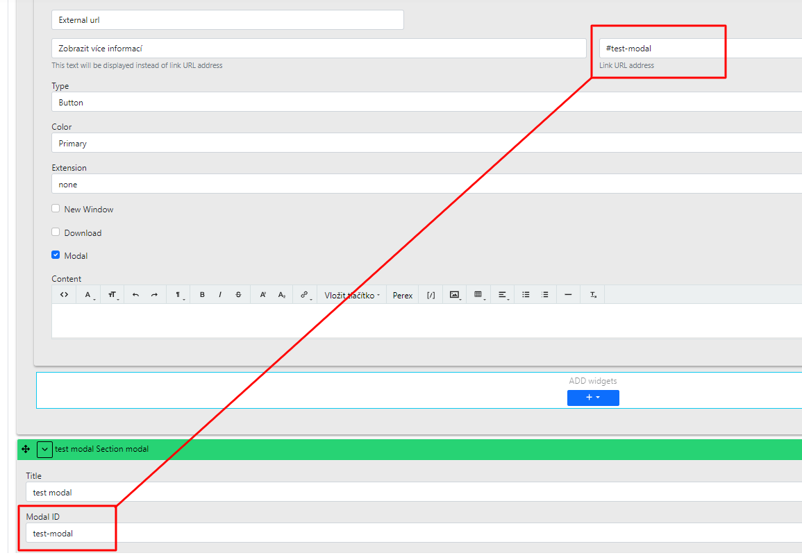
On the CTA widget, set the title etc. (in the button section):
-
external url
-
Button text to click on
-
link url address — set the Modal ID here (additional description below)
-
Extension is left as none, but in the checkboxes select Modal
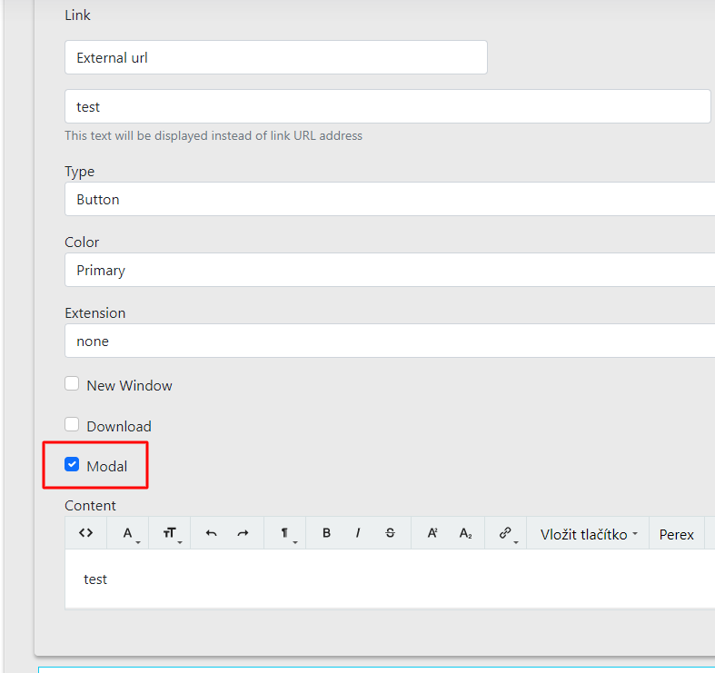
Once we have created the widget from which we will control the pop-up window, we must also create the content for this popup window.
We will therefore create another section, a modal section:
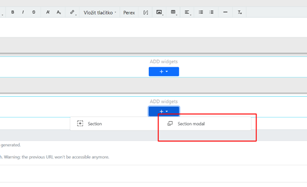
Importantly, the section always needs to have the Modal ID filled in, which will serve as an anchor for the CTA.
In this section, select the wysiwyg widget (the most suitable widget for inserting texts or images).
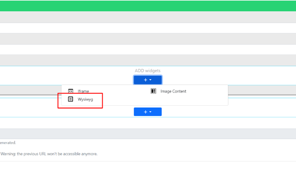
Fill in the content and save/publish the page.
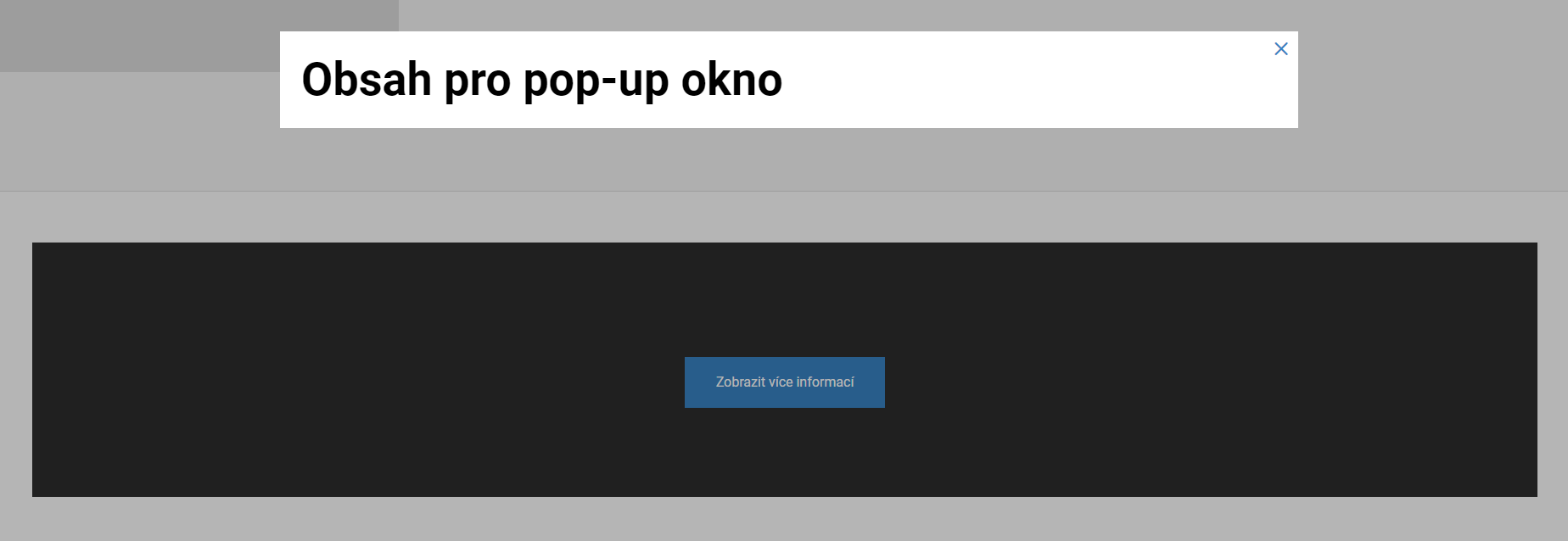
On the website, it will work so that after clicking the button in the CTA block widget, a pop-up window with the desired text opens.
Widget - CTA block
In the widget selector this is called CTA, or "Call To Action".
Using this widget, you can alert, announce, or prompt the visitor to take some "action".
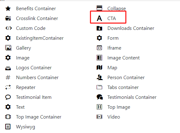
On the website this widget can look like this:
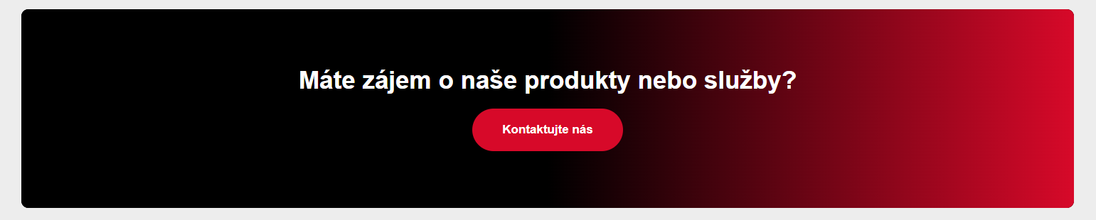
Or for example like this:
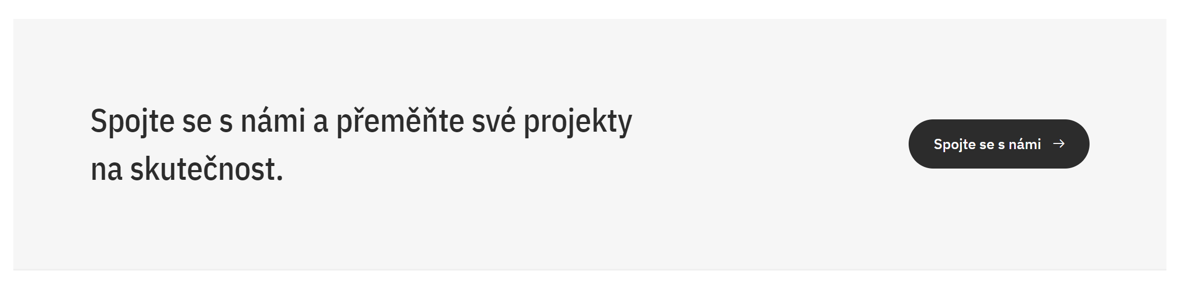
This is a custom-designed widget. The content of this widget can be any text with a button.
In the administration, the widget consists of 2 parts: Content, properties.
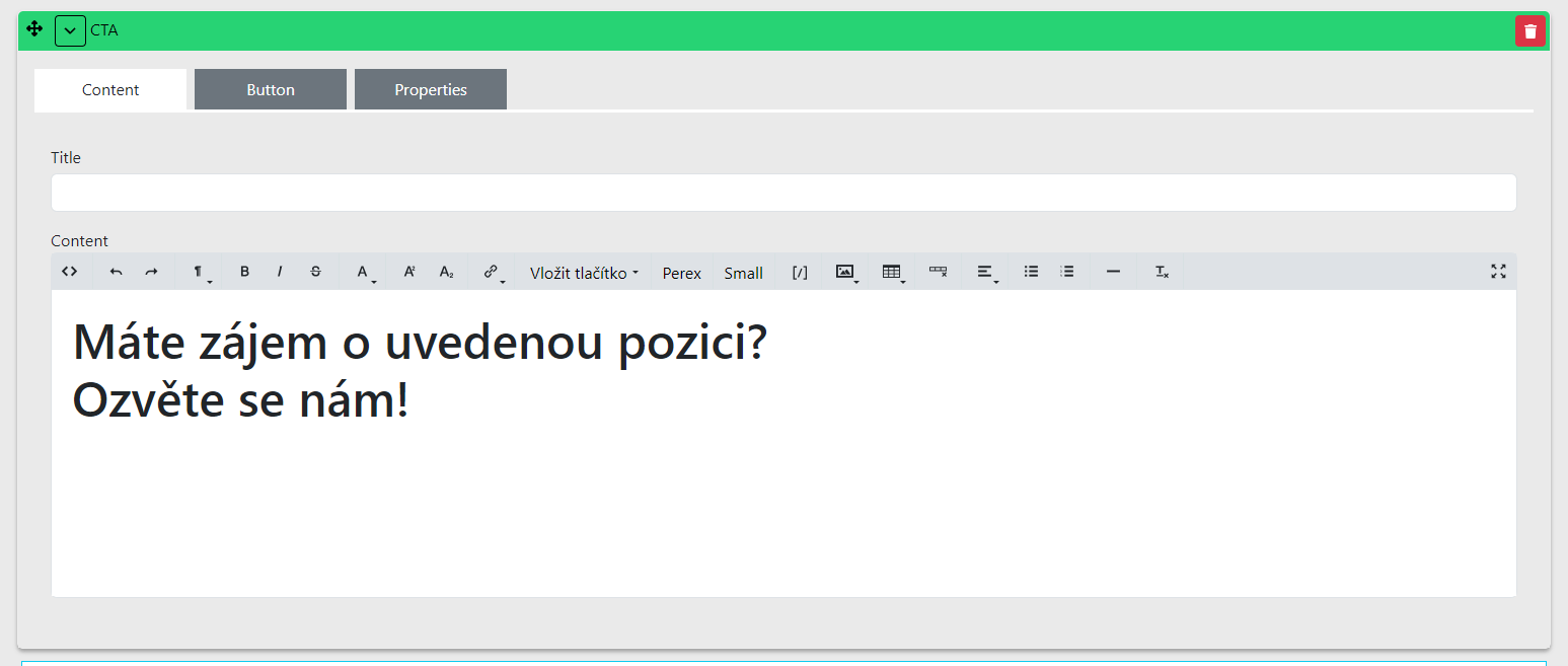
Content:
- Title — used only for orientation within the edited page and is not displayed on the website.
Button
-
Below this field we have the option to edit/add a button.
-
The button is not required to be filled in, but you can choose where the button will link and fill in the text that will appear in the button.
There are two types of button configuration depending on where the user should go on the website:
-
Internal url — you can select a page to link to within the website. In the button, edit the button name and from the selection choose the page to which the button will link.\
-
External url — you can insert a link to a page outside the website. In the button, edit the button name and insert the URL address to redirect to in the adjacent field.
-
Color — here you can set the button colour (primary or default)
-
Extension — i.e. extension = not used
Additional options:
-
New Window — clicking the button opens a new browser window
-
Download — not used by default
-
Modal — in certain cases can be used to display information in a pop-up window or show a form
-
Content — insert the text content of the widget here
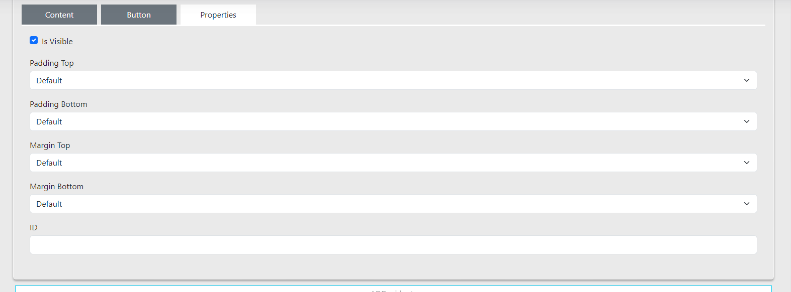
Properties
In this tab there is additional widget configuration:
-
Padding Top and Margin Top is for padding the top of the widget.
-
Padding Bottom and Margin Bottom is for padding the bottom of the widget.
-
ID is for setting an anchor (insert the anchor ID of the link from which you want to reference this widget).
Widget - Wysiwyg
In the widget selector this is the widget called Wysiwyg.
This is a text field that you can edit, similarly to for example in Word.
The widget contains:
-
Title: used for orientation in the administration.
-
Content: used for displaying texts / images / buttons / links on the website.
-
Container type: setting the container padding from the screen edges.
Overview of explanations for the wysiwyg panel:

-
<>— display HTML code -
← go back one step in edits
-
→ go forward one step in edits
-
¶ — option to set text size, such as H1, H2, H3...
-
B — bold text
-
/ — set italics for selected text
-
Del — strike through selected text
-
Superscript, Subscript — set superscript or subscript for text
-
A — set text colour and text background / set smaller text above or below the text
-
Link — add a link to selected text, which can link anywhere.
-
[/] — insert shortcodes using this — you can learn more here (link to be added)
-
Image — insert an image
-
Table — insert a table
-
Add link — add a button to the text field
-
Underline — underline selected text
-
Add custom class — additional text change options depending on the project
-
Align — text alignment
-
Unordered / ordered list — configure lists
-
Insert horizontal Line — insert a horizontal line
-
Remove format — remove formatted text
For all widgets you can also configure the padding of the widget itself, just as for the section. Additional settings can be found in the Properties tab.
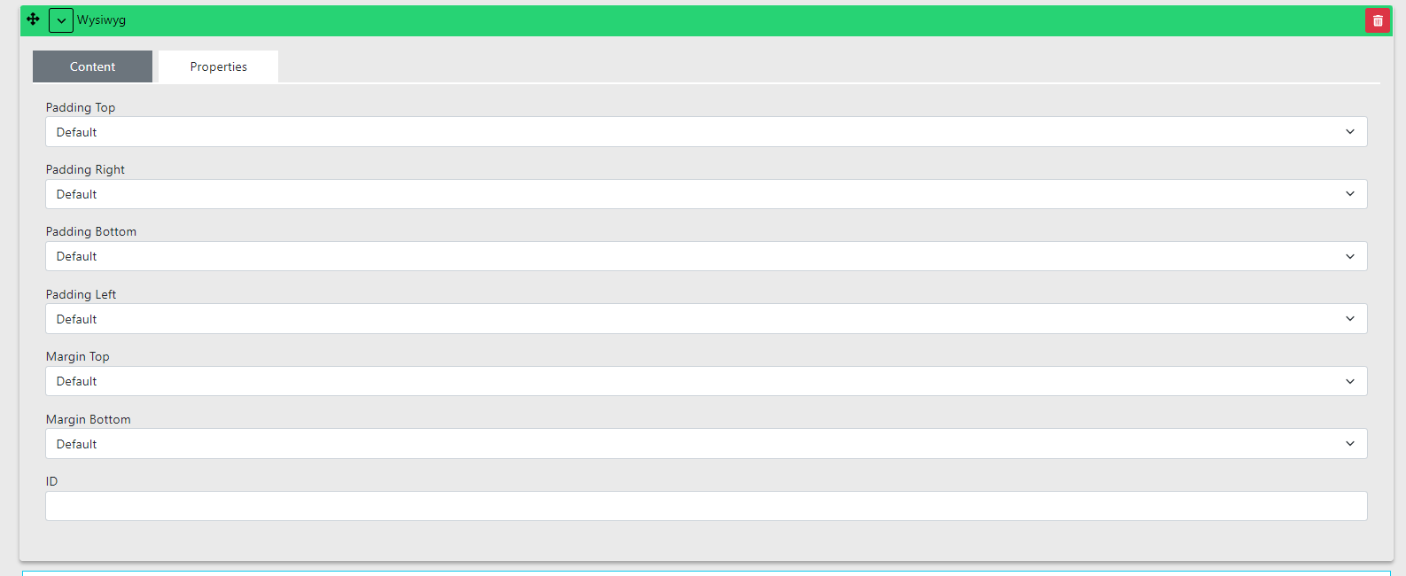
-
Padding Top is for padding the top of the widget.
-
Padding Bottom is for padding the bottom of the widget.
-
ID is for setting an anchor (insert the anchor ID of the link from which you want to reference this widget).
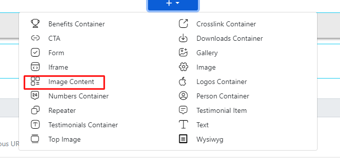
Widget - Image content
- In the section, select the widget Image Content.
- Here we are interested in 3 parts — text content, image and button.
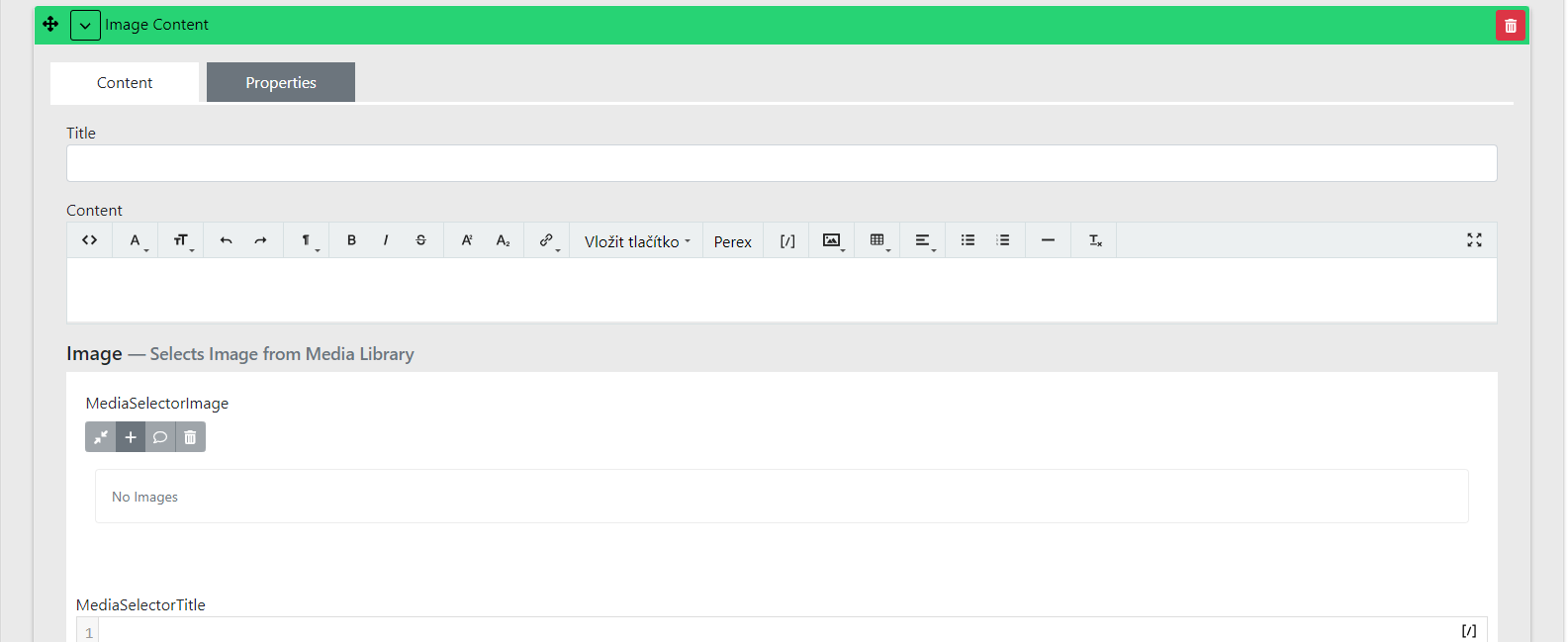
Text content - Content
-
Enter the text here similarly to how you know it from Word.
-
For headings, typically use H1 level.
-
Special display or alignment comes from the design and is handled during development (custom template modification).
-
If you need help with the editor settings, try the guide for the Wysiwyg editor.
Image
-
Insert the desired image here.
-
Always better to use a larger image than a smaller one. We have automatic image processing so the ideal size is always displayed. This means a large image will be scaled down. If you insert a small image, it will be scaled up and will appear blurry.
-
Recommended image size is at least 700 px wide and 400 px tall.
-
If you have trouble uploading an image, go to the Media Library guide.
Button
-
If you use a button, fill in the name and link; otherwise it will not be displayed.
-
The link can go directly to a page on the website or you can use a regular link leading to another website or service.
-
The default button setting always uses the main website colour. If you want to set it differently, see the guide for TODO.
General Image Content settings
Adding a video - Video Link
-
If you want to add a video to the widget, fill in its URL address, for example from Youtube.
-
An image also needs to be filled in here, which will only be shown in the preview.
-
A Play icon will appear on the image so the user knows it is a video.
-
After clicking, the video opens in a lightbox (video playback display) and starts playing.
Type
There are 2 types to choose from: Boxed, Wide
-
Boxed: Keeps the image in a square variant (depends on the specific website design)
-
Wide: Stretches the image to the full width available within the widget
On the website it can then look as follows:
Boxed variant:

Wide variant:

Image Position
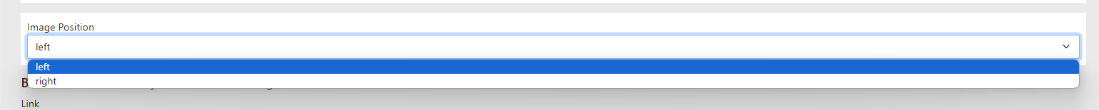
-
Here you set the image display position — left or right.
-
The default setting is left. However, if you are inserting multiple Image Contents below each other, it is always better to alternate the image positions.